Love the third one…
For the sake of debate, here’s the lightest version compared with the darker versions in a (fake) patch.
I should probably add the rack screws to the lighter version for a fair comparison.
1 Like
Still prefer the third…seems more in line with the graphic of the others modules…my point of view, of course. I’m an old timer and like old design (a.k.a. Moog modular, Oberheim…) never been a fan of colour (except for cables) and illustration on modules’ panels…
Hi Marc!
One possibility is to lighten the backgrounds for all of the modules, not just one or two. That might not change your stance, but I wanted to point it out. It’s great to hear your thoughts. Just so I’m understanding, you prefer the original, dark backgrounds?
Yeah, with the new graphics…
1 Like
Like the screws too, indeed…
Ok, noted! I’ll let this thread ride for a while and see what others think as well. I’ll also post to the developer thread to see if offering different lightness/darkness is possible. (I like the screws as well!)
1 Like
Man, these all look incredible!!! I’m also partial to the 3rd one though. But either would do. Very well done Bret. I just want to get in there and start turning knobs.
The “choke thing” as you call it is really more useful for doing hi-hats. To apply swing, it makes more sense (to me anyway) to do that with an external clock.
It was just an idea but I didn’t manage to do it with my limited coding knowledge. . ![]()
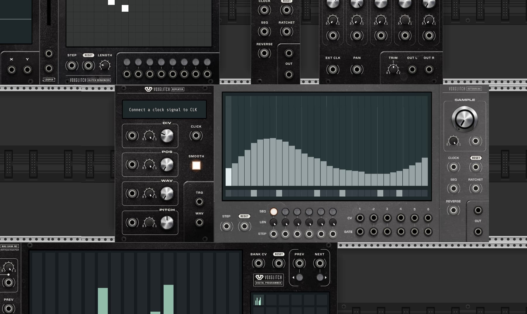
In this example above: instead of giving a “holy glory” to the knob, the LEDs seem to “shine through” the knobs.
It’s always hard to have a consistent design language like your original redesigns and that start tweaking, risking to change what made it unique.
I would take either design as for me the modules are too essential to leave them alone just because of some small aesthetic taste differences.
That being said I do have 2 things I‘d recommend taking a look at:
- Module Name readability: don’t think the rectangle around the module name is necessary and that font is too tight / small
- Color contrast between fonts and background in the modules that display files names like Wave Bank MK2
I think these two are less aesthetics but just plain usability, which given the amount of differently lit environments the software is being used in should be a priority. Don’t want to have to zoom in to check on knob positions, etc.
Suggestion on the color discussion: If you could use the texture and decoration as a transparent „layer“ png you could put that on top of a solid svg background and then let people choose between 2 presets or so. Or turn off the texture completely for a flatter look. (This might have been a comment for your other thread, sorry).
Not only
Dude… Try it. It’s not working like that with Groovebox. The whole thing was about that, the groovebox is ignoring the external swing
I like this light version very much ![]()
I really care a lot about text legibility, and I find the white text on the lighter grey background hard to read. The font is already a little small, and all caps and sideways don’t make it any easier to read.
Id go with the darker version…
Thanks for all of the feedback. On a separate thread, I received feedback from @Squinky that it may be able for me to allow for some customization of the darkness of the panels. I’ll be testing that out in the next few days.
I’m sure that Chris, the designer, would agree on this. Although, I do agree that Digital Sequencer might need some tweaks to remove the sideways text and clarify things a bit. Most of the other modules seem pretty solid.
I 100% agree with this. I’ll attempt to increase the font size first and see if that helps. If not, I’ll work on the color scheme. ![]()
Here’s the battle plan for me:
- See if I can gracefully implement the ability to change the panel brightness and possibly even give the option to choose solid colors instead of textures. At the very worst, this might be done in a config file.
- I have some updates on some panels that still need to be made.
- Get outside and go fishing.
- Contemplate the panel layout and attenuator design with Chris
Thanks for all of the feedback!
Sorry, did I miss a conversation? Is there anything that I can help clear up?
OOOOOOOOOOOOOOOOOOOO those look fresh. Niceeeeeee
1 Like
Hey man, just a heads up: All the i/o jacks on Satanonaut appear to be inoperative with the new GUI. I also noticed some freezeframes and lag when attempting to plug something into the input or output jacks, which didn’t work.
Ok, thanks for the heads up! I’ll put that on my to-do list for today!