That’s an excellent idea. Let’s see if that’s necessary before I dive in though!
@FiroLFO , totally understood. Could we talk it over, because I sympathize with you. What options should we experiment with?
Here are a few ideas:
- Remove the sequence length numbers. They’re not 100% necessary, and they do add to the visual compexity.
- Take out the lines around sequence groups
So far, I’m talking about simplifying, like so:
Then maybe remove the Voxglitch logo and simplify the outputs sections as well? I could mock that up and see how it looks? (I hope that Chris is OK is open to this feedback as well.)
That ‘raised’ area around the outputs is one part I’m not sure about on all the modules - but I understand why you want to visually highlight that area.
it’s interesting what FireLFO said about Digital Sequencer - I think the main problem you have there is that the original panel just looked very good indeed so it’s a hard one to beat!
I think I prefer the simpler version, although not 100% about losing the length numbers and they align with the output numbers to the right.
Exactly the point.
1 Like
Ok! Cool beans. What I can do is create an updated design (using the new colors and controls) that very closely follows the layout of the old design and see how it looks. I’ll try to get that done today, post it, and we can debate it. I really appreciate your feedback. ![]()
Awesome…
Hey Bret, I haven’t chimed in on this thread before, but I am a sucker for nice graphics, so I gave the development build a test. It crashes Rack as soon as I load the library. Would you like me to create an issue on your github and post the log or are you aware of some issues and will address in the future. I’d like to provide you with helpful feedback, but not burden you with anything unnecessary. I have reverted to 2.19 and everything is fine again.
Before Rack (v2.1.2) crashed, I was able to see the graphics. Very nice!
1 Like
Hi Seth! Oh, that’s a bummer! No need to open an issue on Github. I’ll start looking in to it immediately. Would you be able to send me the log file after it crashed? Maybe one of the resources is missing. Thanks!!
*** UPDATE ***
This bug has been fixed, and the original shared file has been updated with the fixes.
Interesting… Itt looks retro, I like it!
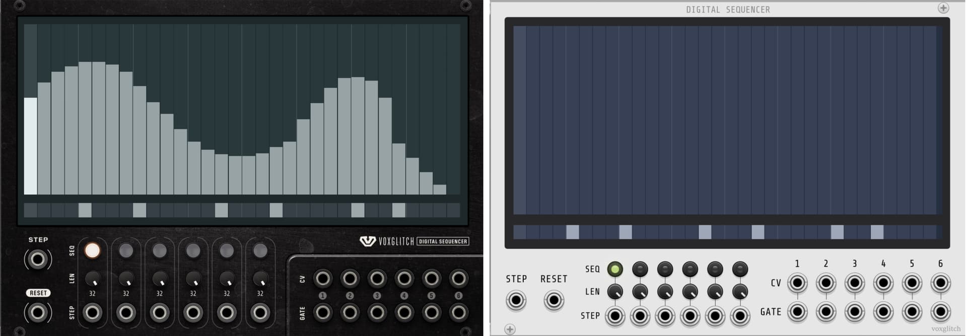
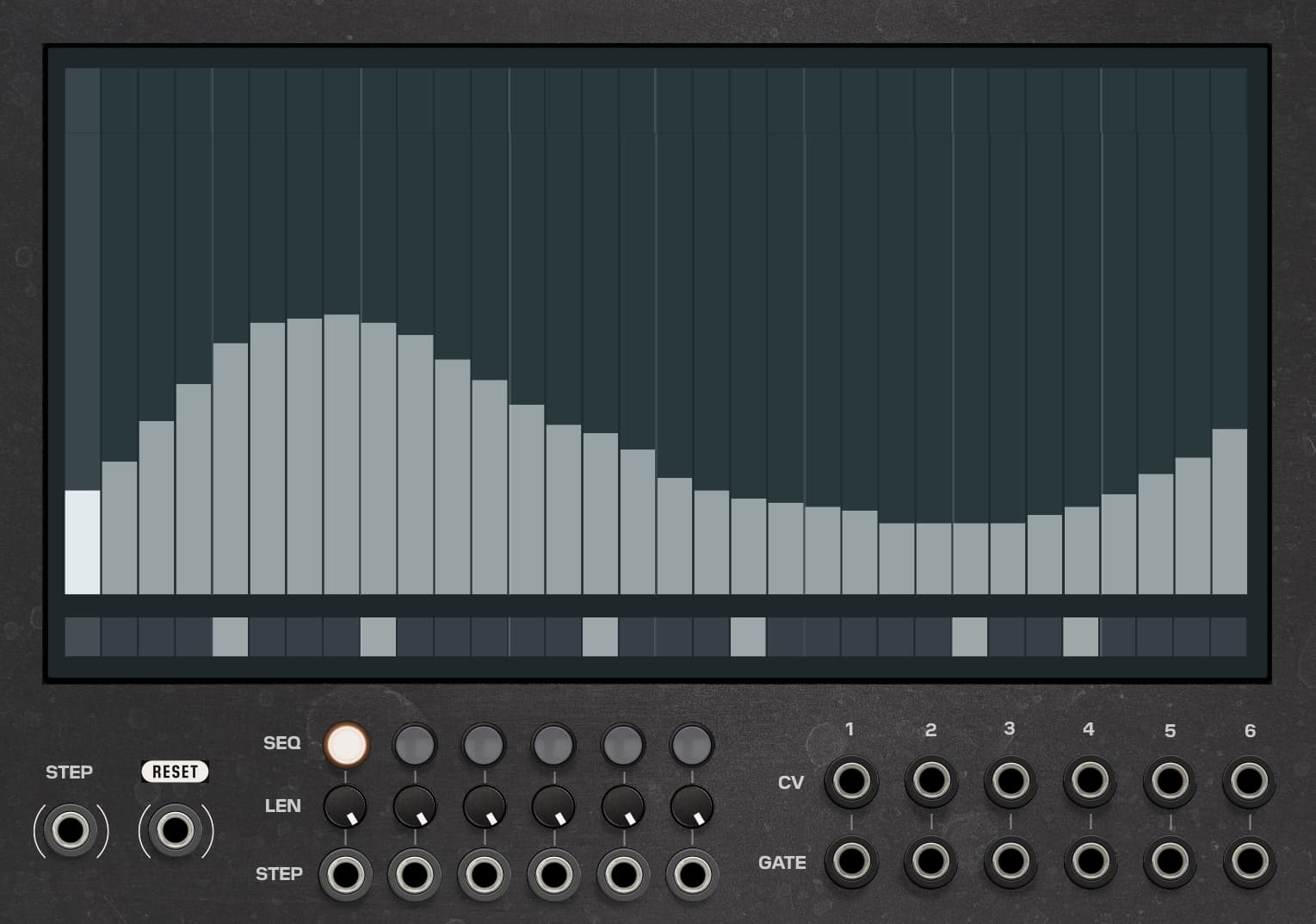
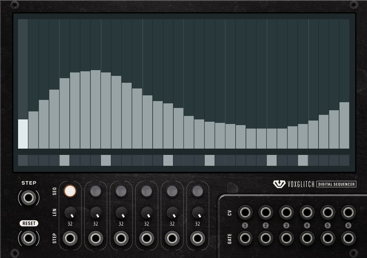
I’ve tossed together an image that shows what the Digital Sequencer module would look like if I simplify the design back to the original layout. Here, the current version is on the left, and the simplified panel is on the right. I’d love to hear your feedback!
Something that I notice is that the outputs are somewhat difficult to see against the dark background. Maybe that can be fixed somehow.
I don’t have any issue with the output colors. But the LEN knobs are almost unreadable. Some contrast would be nice.

Ha ha ha. I just re-added the numbers over the outputs, but I could remove them. I pretty much agree with everything you just said. I wonder what to do about those small black knobs. I might have to consult Chris on those to get his take. Maybe making them grey, or metal, would work.
Thanks for taking the time to create that infographic!
The one on the right, I love horizontal text, vertical text makes me look like a dog
1 Like
Hi Peter! Thanks for the feedback. So far we all seem to be on the same page.
1 Like
Yeah - vertical text should ideally be avoided if at all possible (I have done it so there are times where it is necessary - but your original design shows that this is not one of them)
Generally much preferring your tweaks. One thing that became clear when designing the MindMeld dark panels is that ideally you don’t want the background to be too dark - because you always want the ability to have elements that are darker than the background and to have enough contrast for them to stand out. A very subtle lightening of your background could work wonders in making your blacker length knobs stand out more. It’s amazing what a difference that extremely subtle changes can make when it comes to contrast.
1 Like
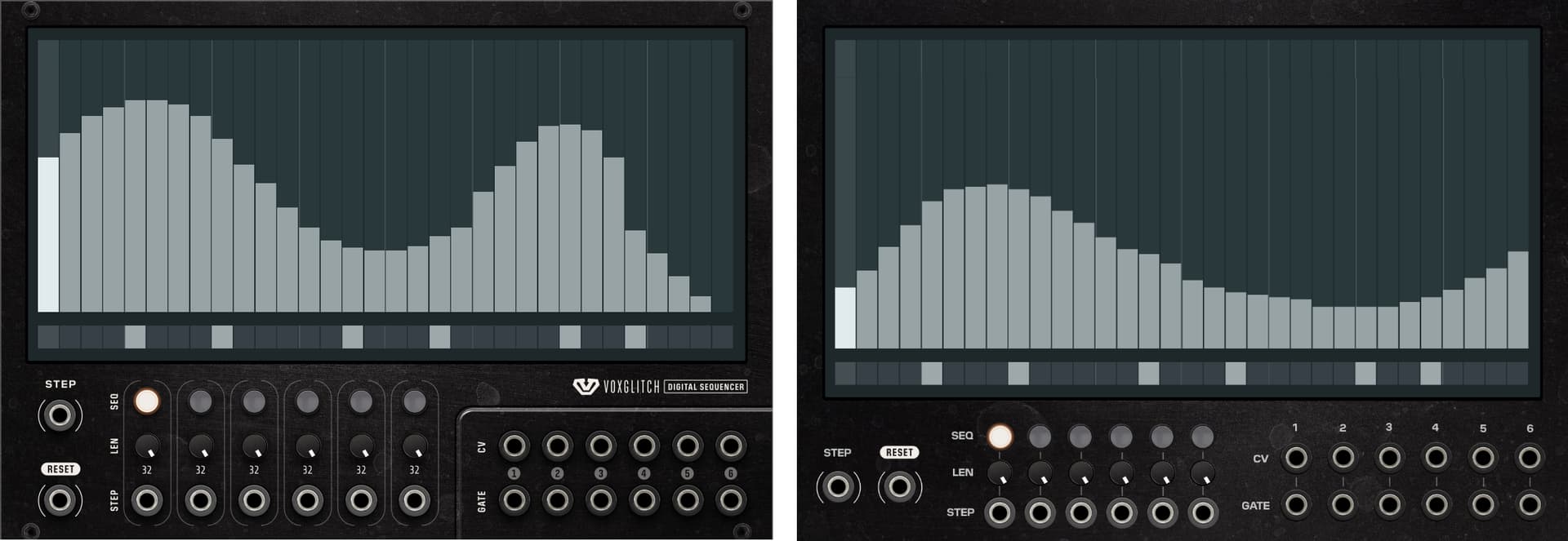
Here’s a version with slighly lighter background, and (sloppy) hand-drawn shadows under the elements.
Here’s even a lighter version:
And here’s the comparison panel:
I’d love to hear your thoughts!
My initial thought was that the middle ‘even lighter"’ one was too light - but in terms of clarity it’s the clear winner.
I’d like to see something half way between the first and the 2nd.
(For reference I spent literally days agonising over the most subtle changes to background/button colours when doing the 3d redesign for V2… it’s not easy to get it right when doing dark on dark)
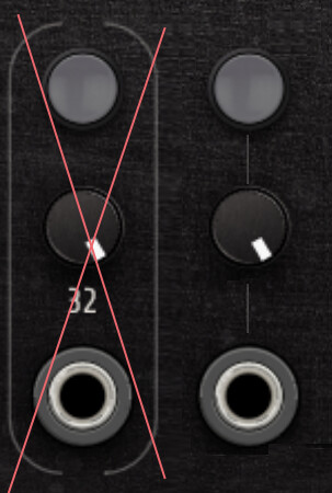
Another thing to perhaps consider with regards to contrast is the gradient on the length knobs which are lighter top left going to darker bottom right, Taking a tiny amount out of the top left highlight would make them pop out of the panel more in the top image for example.
I appreciate hearing your experiences with panel colors. What I might do is create rough mockups of 3 or 4 modules, then see how they look when placed in context of VCV Rack.
Sorry, I may not be following here. Are you suggesting making the tops of the attenuators flatter? (Less gradient?) Wouldn’t that make them darker?
What about putting constantly glowing LEDs behind the knobs? It could provide some glory…
Interesting! Could you show me a real-life example of that?