Thought I’d start a development blog to share progress and get feedback on some recent work I’ve been doing with Martin at Rebel Technology. Martin is based in Barcelona alongside Befaco guys and was interested in bringing some of his creations to VCV rack as well.
What’s included
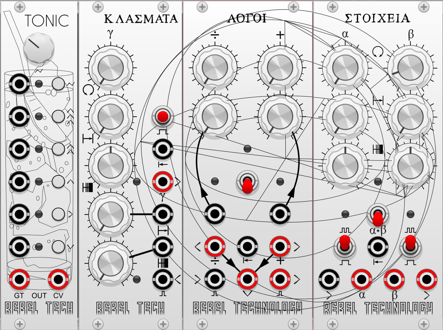
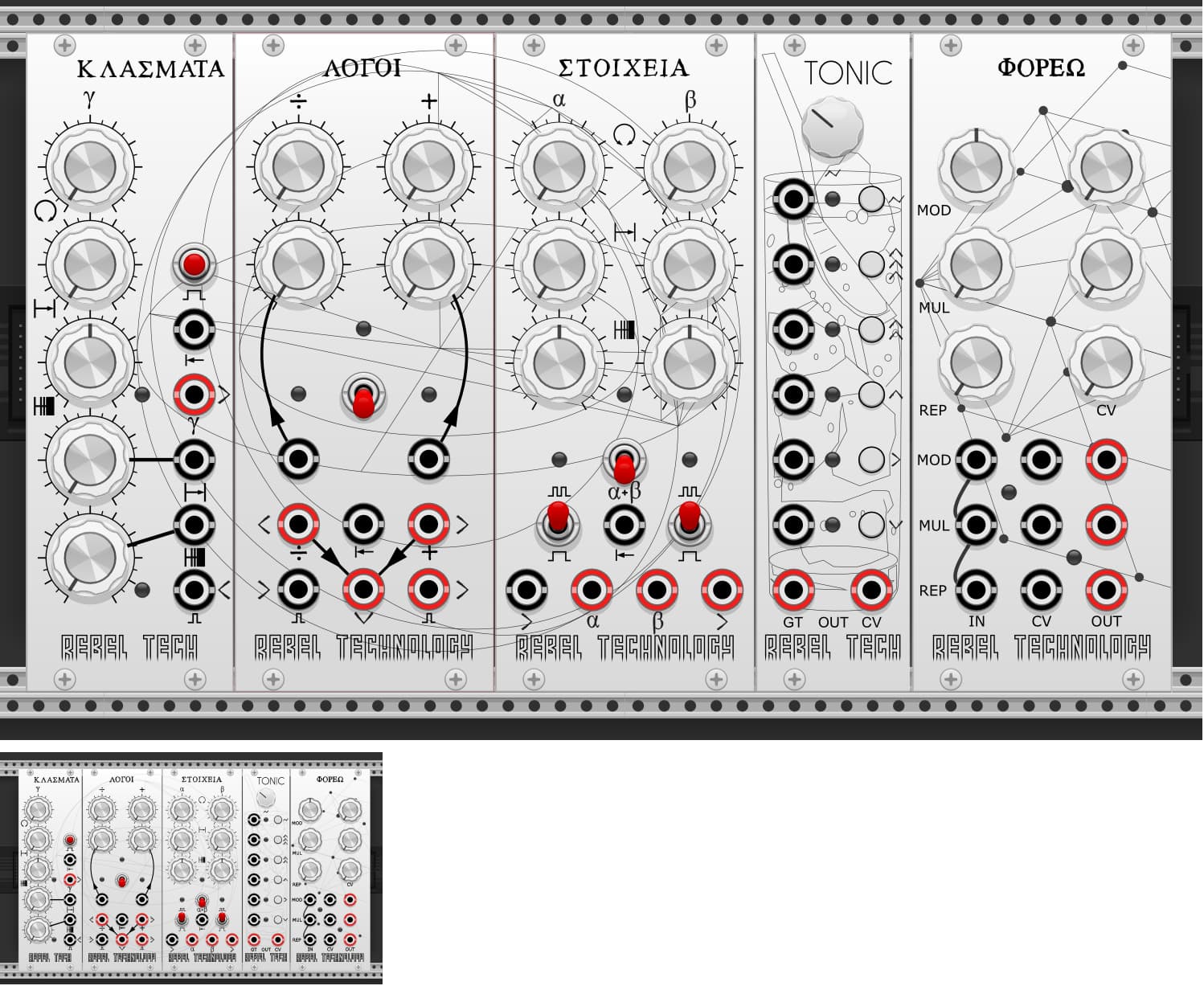
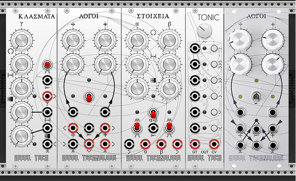
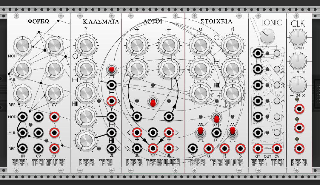
We’ve started with a selection from the Euclidean Series and for the initial release we will be including the following:
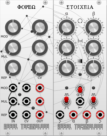
Phoreo - function processor for gates/clocks that simultaneously performs pulse width modulation, multiplication and repetition.
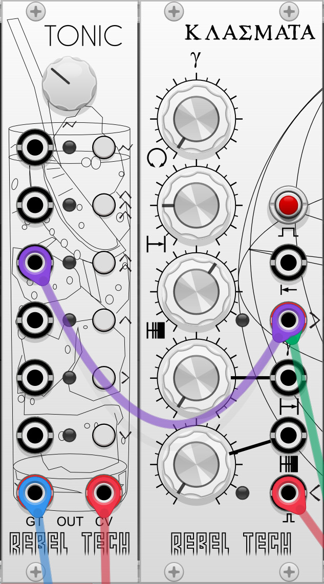
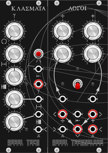
Klasmata - CV controlled Euclidean sequencer
Stoicheia - dual channel Euclidean sequencer (two independent or one chained)
Tonic - additive interval pitch sequencer that turns triggers into melodies
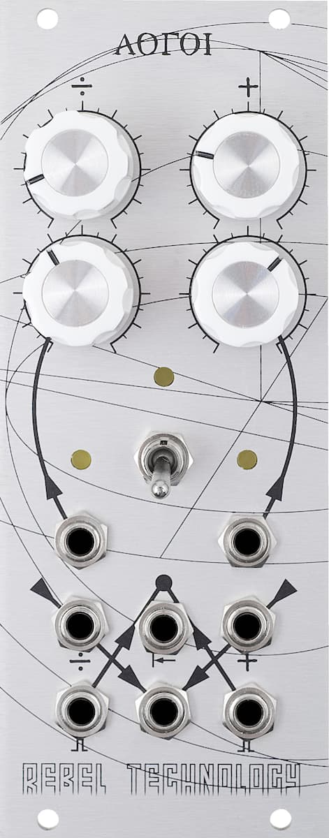
Logoi - voltage controlled clock divider, counter, and delay.
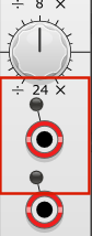
CLK - three channels of clock pulses (gate / trigger modes supported)
These are intended to be relatively direct ports of the original Arduino source (with a few minor deviations to be consistent with VCV standards), differences are listed here.
Details
If you’d like to help test them out before they hit the library, you can head over to the preview release page on github. Any issues feel free to log there or here. Code is open source and released as gpl-2.0-or-later.
Future releases
Once this is happily out the door, we will explore adding a dark mode.
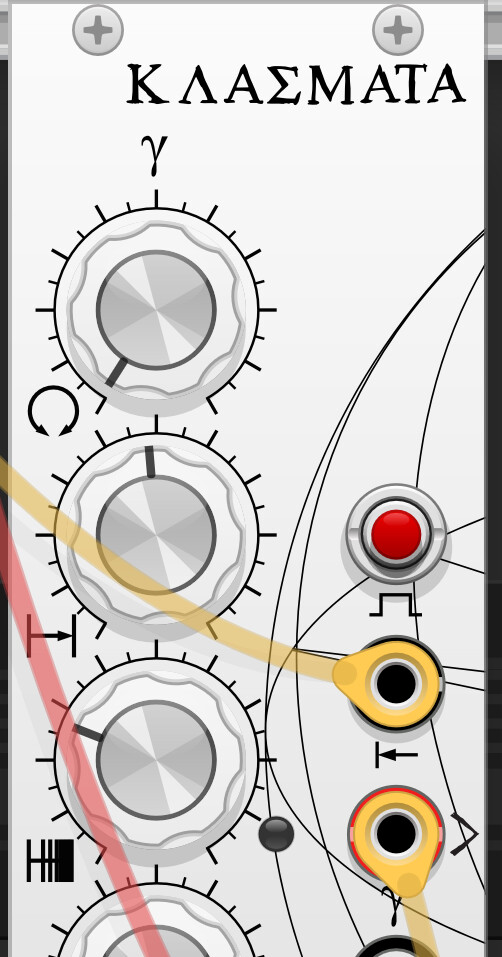
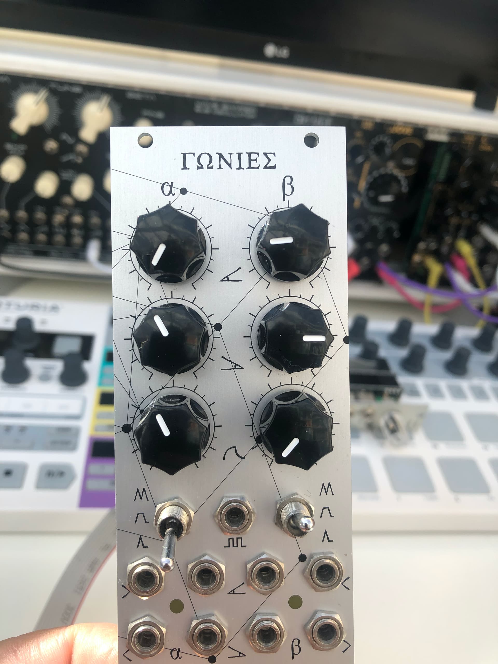
One suggestion on the UI - perhaps make the various geometry lines a bit thinner/lighter? - they seem to stand out much more here (and are more distracting) than on the hardware Gonies that I have - the lines on that are super fine.
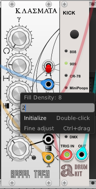
@FiroLFO Great catch. Fills (density) and offset are actually functions of the total length, so under the hood the knob is 0.0 to 1.0 - I was missing custom code to convert back from user values (integers like 2) to this representation. This also helped me catch a minor bug with Stoichea, thanks! The fix has been pushed/build updated.
@steve - do you have a screengrab to show? And is it still an issue when you zoom? I’m trying to work out if it’s a rendering thing or an SVG thing. For me this is the thickness on full zoom:
To be honest I was mainly going from your screen grabs and had not installed the modules yet - Now I have and I agree with Yeager that the lines on Tonic seem to be a bit lighter finer and therefore better (although they would still benefit from being even finer imo)
Here’s a quick photo of my hardware - the lines are very thin / hairline and seem much more subtle compared to the VCV render. They sit in the background and don’t fight visually with the other interface elements.
Good catch and suggestions all, turns out the Klasmata lines where doubled up throwing off the renderer. After reducing darkness of lines and making them thinner, it now looks like this (few zoom levels):
I think the knobs still look a bit like background elements rather than things to interact with. If they were black then they would appropriately stand out much better. Or at least if the knurled perimeter ring was black, and the direction pointer (whatever it is called) a white line on black.
I know what you mean. If anyone (especially @pyer, whose original it was derived from) can help, I’d appreciate it - I a little out of my depth! Would be good to keep to the original white knobs though:
The knobs is a tricky one - the issue is contrast and it’s hard to get contrast with white and silver (light grey) knobs on a silver background in 2D. I swapped out the original knobs for black knobs on my Gonies in the photo. Agree you should keep the original white knobs here though.
Comparing your hardware photo to your renders, perhaps you could make the grey backgrounds slightly darker and add a little extra blue and maybe a touch of red into the grey mix to try and get a bit more contrast with the white of the knobs. Maybe try something like #D8D7D9 for the background and make sure the white of your knobs is really white not light grey. Subtle differences in contrast can make a big difference to perception. I perceive little difference between the white of the knobs and the background panel colour in the render now, but I do clearly see the difference in the photo.
Concerning CLK’s UI, I’d like to see some space between the top LED and the “24” label.
In other words have all 3 LED + line + port groups moved down a bit, as well as slightly narrowing (maybe) the space between the port and the next LED down.

")