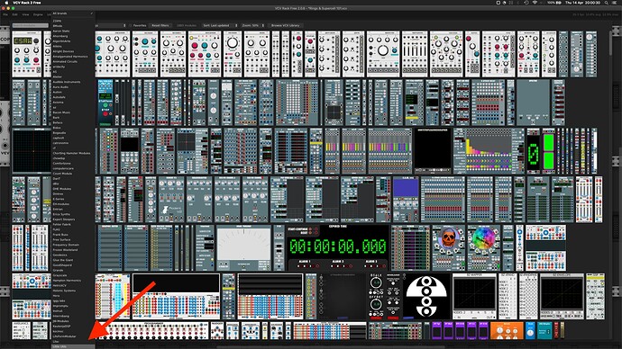
Been a while. Just installed v2. Can’t navigate to any brands past the letter L; they’re off the screen. No scroll bar. And I don’t have a scroll wheel mouse. No key combinations seem to work. Surely I’m missing something incredibly obvious? ![]()
Use mouse scroll wheel to see past letter L. I thought I had the same problem until someone pointed out how V2 browser works.
Edit: Oh, you say you don’t have a mouse scroll wheel, so I’m no help.
Perhaps cheaper than a scrollwheel mouse (they have a trial).
Don’t know if there’s other ways of moving down the list.
You’re not missing something and I find it infuriating as well. Definately the worst part of Rack’s UI at the moment. I’m guess Andrew just forgot to add a scrollbar to that widget and it should definately support keyboard too. Really crappy UI.
Can’t stress enough how useful it is to practice searching for modules by name. It needs a few hours of patching, but once you get to it, nothing is faster. I really don’t like the module browser, so that’s the way to circumvent it completely.
It is annoying. A 2D grid would be better than a 1D list.
Personally I would prefer:
- A regular combo-box, where you can type to filter.
- Support for keyboard: arrows up/down and PageUp/PageDown.
- A scrollbar.
That would completely make me happy.
Good reminder. That is actually what I got in the habit of doing although there are still plenty of times when I need to look at the brands or tags list and scroll through it.
I can see what looks like a scroll bar in your screenshot. Just at the top right, near the third nysthi module is a gray oval shape.
That’s all well and good, but many modules have rather … outlandish names, so if you don’t use them frequently it’s difficult to remember them by name. Filtering by tags isn’t always useful either, such as some “blanks” that are tagged only as “visual”.
Also, (not much help either) on my MacBook I use the two-finger swipe to scroll up and down. It works fine.
Absolutely true. And a lot of modules have similar names, which makes it really hard to remember which shortform to use to get it and not the other one. That’s why I like silly names. Computerscare for example is so easy to remember, “Knoly” for example will give you an immediate result.
I do search/browse for modules too, just not longer for the bread&butter stuff with this method.
Wow. Surely an oversight. But there’s been a few updates already and no fix yet.
That’s the scrollbar for the pictorial display. Need one for the Brand drop-down menu.
I’m not into hacks but thanks for suggestion.
I agree. I defaulted to name search in v1 when the favourites option got removed. So glad to see it’s back! I’ll be using favourites most of the time. But first I need to be able to get to the modules to tag them. Working through this process by Brand is the best way.
Only other workaround I can think of is to uninstall/reinstall brands in groups e.g. A-H, I-P etc. Hopefully the favourites tag is retained if I do this. REALLY don’t want to though.
Rack is amazing. The menu system is not. I’ve always thought it feels like an antiquated Java app, especially the horizontal mousing to adjust sliders.
Gonna email support.
Another workaround is to type the brand’s name into the search-field.
Sorry, misread the OP
Discovered it’s also missing in VCV Host plugin drop-down.
Until it’s fixed I’ve reluctantly settled on a hack using Karabiner Elements (which is free): Right Alt/Option key assigned to scroll down.
Thanks for the help. And thanks to devs here for making modules!
Has anyone submitted a formal bug report/feature request to support@vcvrack.com ?
Yes. In April.
This on the to-do list? Been three releases since reported ![]()
this is not the place to ask about any “to do” list. We don’t know.
I still cannot scroll the brand names. But more concerning is that I have the same problem in Vult Opulus when trying to access the bottom of the presets list. Is this a VCV issue or a Vult issue?
I tried using the two fingers on the touchpad trick to scroll, but it does not work on Opulus. It just jumps back and forth between the top two presets.
