Hey guys, I made a poll to vote on the UI layout on a new module, you can vote here
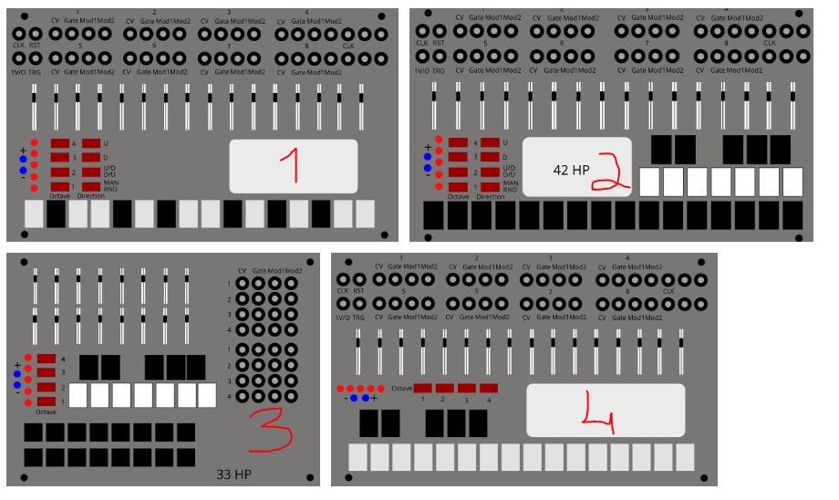
- 1
- 2
- 3
- 4
0
voters
Hey guys, I made a poll to vote on the UI layout on a new module, you can vote here
I’ve voted for option 2 because it’s important to see groups of elements easily: on your other options, all 16 faders are following one another. Option 2 gives 2 groups of 8, which is better to distinguish them.
Furthermore, your connections are properly aligned on a grid: i.e., all CV are on the same column, all gates also, etc. and each step on a line.
This might not look like the most “elegant” version at first but it’s by far the easiest to navigate on a daily basis, IMHO.
I’ve taken a look but I must admit it’s hard to pick a winner without some sense of the context beyond the mockup being that of a sequencer.
Significant considerations would be the relationship between the circular and slider based encoders. Another question is whether the white panel (indicating module size on some design options) is used as a data feedback mechanism.
Apologies if this seems to be over-complicating the task, but I believe without context we’re at risk of making subjective design choices based on geometric preference rather than interaction design requirements, and their impact on user experience.
It would also help if the designs could be viewed real-size (I did attempt in vail a right click to open in new tab but the image size was still a ‘thumbnail’).
Aesthetically I prefer 3, but I take @jonathan.moore1’s comments on board entirely.
I would have voted on the poll itself but wasn’t sure why both logging into Google AND email address submission was necessary to complete it?
Might be unfamiliarity with setting up polls? I’ve tried putting in multiple polls on a single post in the past (so users could do range voting), and the board ate my post instead of putting it up.
Those are good points, thanks for the feedback. Clear navigation and ease of use in a live performance are main design goals. Do you think having silkscreen groupings would be enough to address this?
No apologies necessary. Yes this is a very early stage, and I’m still trying to determine a balance in size/features/workflow. The white panel would be a screen, but I’m undecided about it as it may detract from a more playable workflow as a main goal. Regarding size, everything is at scale to the eurorack format.
Google forms requires login to make the polling unique.
Polls are supported on this forum.
I looked around and couldn’t find how to, is there a guide?
I felt 1 was better layout for me.
Thanks, it’s the busier version, but also direct independent control of the steps and keyboard. This becomes more relevant in hw form.
Click the wrench icon in the reply text box.
You need to have earned the Basic badge to create polls. You get that badge “for sticking around and reading a few topics to learn what our community is about”, so I guess you just need to click around the forum for a while until you get it.
I see, thanks.
I think there’s a danger with virtual modular that it slavishly follows hardware modular. Take Braids and Plaits. In hardware form Plaits is preferable to Braids but IMO Braids still works well in virtual form.
It’s definitely the case that LCD’s with dive in menus can be a nightmare in hardware when in a performance situation. You only have to look at the Elektron forums to see evidence of this.
And much as I enjoy working with Clouds in hardware form I hardly ever turn to it in either of the virtual versions I have available to me. In VCV I’ve used Clouds for little more than testing purposes. The reason for this is that I have some fantastic Max4Live devices for granular synthesis because of its excellent visual feedback (Max has always been an ace platform for granular stuff). And over the last 12 months or so I’d estimate that I use IOS options most often as a multi-touch interaction model is heavenly for granular stuff (especially with the extra real estate of the iPad Pro).
What I mean by all this is don’t make the automatic assumption that the faceplate design should be the same for both virtual and hardware. There’s an obvious benefit of familiarity but screen and hardware interaction models are very different. And much as some moan about the dive-in menus in Braids, I think once you’re familiar with the interaction model it’s a very effective visual feedback mechanism.
With your proposed module having so many rotary and slider encoders my instinct would be to take a lead from the faceplate design of both the Arp Odyssey and 2600. The plate design on both of these does a fantastic job of reinforcing the signal path and relationship of the various encoders (this was even more important on the 2600 which had to communicate ‘normalized’ signal paths as well as those afforded by its modular paths). The Odyssey was famous for allowing musicians to create new timbres on the fly during live performances.
Based on what you’ve said with regards to your goals, Option 1 or Option 3 would be my preference, especially if there’s a functional relationship that symbiotic to the spacial relationship between the sliders and rotary encoders. As much as Option 1 is spacially congested in comparison to Option 3, there’s a clear delineation between the elements. With Option 3 being a less dense design, that may be preferable in a live situation, but the devil will be in the detail.
Do you mean the control layout and/or the panel labeling of the ARP?
Regarding control relationships, yes, the original idea was a vertical correspondence for steps 1-16, thus wanting to avoid the more compact 2x8 layout.
Indeed, SW and HW workflow doesn’t exactly translate. I reckon skeuomorphism is of limited use when trying to proto HW. A multi touch UI would definitely be a closer workflow. I have yet to devise a way to test that.
I understand the login, which I did, but after I made my faceplate choice it then asked me to submit an email address ?
The panel labeling and the hints it provides ref signal flow.