I like using Icon fonts, and have been thinking about making an icon font for my Rack modules to use. You can think of an icon font as a little more than a single-file library of SVGs which can be efficient – one file to load, and smart font systems cache the rendering to pixels (or meshes/textures in the case of GL-based rendering), making them potentially more efficient than a raft of SVGs.
If I decide to go this route and actually invest in making a font, I would open-source it and make it available under the SIL open font license so anyone can use it for free.
Yes, I know some will ask why not use labels? Labels are readable (if you read English) and variable width. Icons can be a much more uniform width, lending themselves better to grid layouts. For comprehension, that’s what tooltips are for, but a good icon design should render that moot. I’m more interested in feedback on how to design good symbols for Rack modules that gets the idea across.
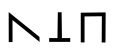
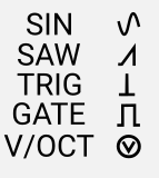
Symbols for basic waveforms are easy. Here’s ideas for Saw, Trigger and Gate:
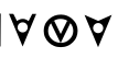
The one I’m struggling more with is a good icon for V/OCT. Here are a few ideas so far:
What do you think? Please propose alternatives or describe ideas for making one.
I think it would be better if Gate symbol would have a 0v tail… That way it would be much clearer, easier to understand what you’re looking at.
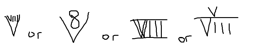
What about a note? Or e^x, haha. I mean, it’s exponential after all! Or maybe an exponential graph… If you want something strange and maybe not exactly user-friendly - I have an idea! So octave is 8. And 8 in roman numerals is VIII. So you can play with that. Like this:
For the saw, I’d flip it left-to-right for a waveform that (by default) rises over time.
I prefer the middle one for V/Oct because the others look like arrow heads, as if to indicate “down here”. Also, the dominant “O” reinforces the notion of “octave”.
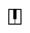
Yup. That too. Maybe on both sides, like a slab serif. And it distinguishes it from the Cyrillic character “П”, Unicode U+041F. (Not that that’s a big deal.)
Why make a font? If you want to, that’s great. Seems like loose SVG is easier, and any efficiency issue would be unnoticeable. Obviously static text on a panel is rendered to discrete outlines anyway.
I think maybe the front panels are too small for a text. But even if not and it’s just an artistic thing - isn’t it cool? I mean, psychologically. It’s like a puzzle that you have to make very simple for the other person to solve! Well, given that these modules are meant to be public, of course…
Why make a font? Well, I’ve fantasized about making fonts since the 70’s or 80’s when I was very interested in typography, and never got around to it. Now that I’m writing some modules, I have a potentially useful project. A font can provide a systematic structure for layout and positioning in relation to text or other symbols and provide ways to combine components of symbols. It also provides easier ways of manipulating color than can be done with SVG. True, a bunch of loose SVGs might be more effective in a Rack context, and simpler in many ways. I can try it both ways and see what works. I also have other music-related software projects in the works where an Icon font would make a difference.
Revised designs including feedback + SIN wave. Compared side-by-side with corresponding text in all-caps Roboto at the same vertical height. Note how these designs have a line weight very close to the Roboto font commonly used in Rack modules.
I think the v/oct symbol can be slightly larger and a little more whitespace, and the gate slightly shorter.
I’d like suggestions for other symbols that would be useful.
I was never a fan of all caps for panel text, but that’s just me. I tend to use Robato regular, usually like 13 or 14 points. I think my svg for wave forms uses a “heavier” line when selected? Don’t quite remember. Your stuff is looking nice.
I asked the Internet, and the Internet told me that all caps is less legible than normal text. Some ppl like more legibility, some like less, and some don’t care. That’s cool. It’s a big world out there!
Yup. Robin Williams sez so too. If you take some familiar phrases, and replace every letter with the smallest solid rectangle that contains the original character, it’s usually easy to read the phrase if the originals were normal upper- and lower-cased letters. Can’t do that with all caps.
This is from “The Mac is Not a Typewriter”, by Robin Williams (No, a different Robin Williams.)
True for readability, but that’s not always the primary goal. In a Rack module, the use of all caps pushes the text to function as a simpler visual unit that is more consistent than mixed text would be.
Here’s a principle of user interface design I’ve learned: people do not read a user interface like they would read a sentence (unless forced to by a bad UX) – they scan for visual markers. This phenomenon can lead to trouble when constructing labels that must be read, such as “Don’t Save”. People will easily miss the “Don’t” part and perceive the highly familiar “Save” and get the wrong result. There are other problems when using text with a negative sense in UIs, particularly for users that aren’t native English speakers. Whenever possible, everything should be cast in positive terms.
It’s mind–blowing to observe this phenomenon in a UX lab watching users try to navigate your UI. It’s a good thing that in these labs the observation booth is sound-isolated from the user so that they can’t hear the developers yelling “it’s right there in front of you! Your mouse is right next to it!”.