…it is not your?
no worries, I can pick your palette from the image
that is from a while back! 
i haven’t bothered theming that module anymore, in V1 i don’t use it anymore.
80% gray in Inkscape for the background,
and the others if they were edited too, probably 30% and 50% gray.
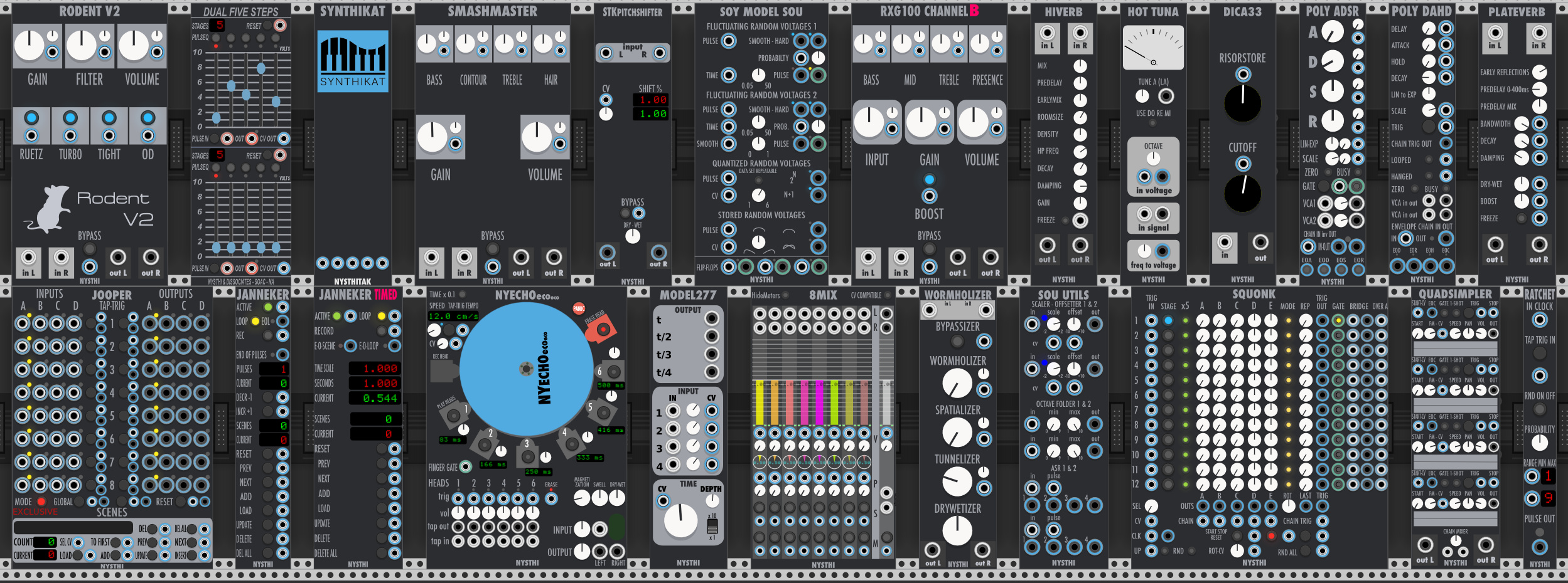
I’ve done a dark version for nearly all NYSTHI modules, some of them I left as they are though such as Simpliciter. The samplers’ sample display probably could do with a colour change.
wonderful
very cool !
pity that a lot of knob and button are official ones, maybe a whiter version is needed
Whiter knobs and buttons? How about this:
I also took a stab at this using a more gray background and more muted color palette (inspired by the Stellaire stuff). We’re both definitely on the same page.
Nice, yeah definitely going in the same direction!
I’ve changed the buttons to lighter colour but I’m not really sure what kind of shade or colour to go for with them.
This little exercise has given me an awful lot of respect for what @pyer does!
This is great, really like this take on the MSC mixers!
to me those white knobs are way, way too bright. soften it to some nysthi cornflower blue maybe? or take pyer’s colored knobs from simpliciter?
Here’s my take. Getting there (towards the end anyway).
I’m happy with just about everything except the ports (particularly those orange ones and half-colored ones). There are just too many colors and port options for my personal taste. I may find one or two styles that work for audio vs control signals then go back and replace some of the others. Too much color-coding distracts the eye IMO.
I like it, you’re hired! 
and could you share your dark squinky labs theme please?
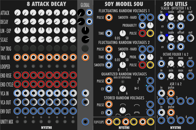
and here are my dark pastel versions of chronoblob2 and t-wrex:
That Chronoblob and T-Wrex set look amazing! Very tastefully done. 
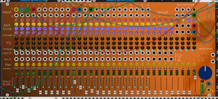
Here’s my version of mscHack mixer color hack. and I’m streaming it LIVE now Twitch
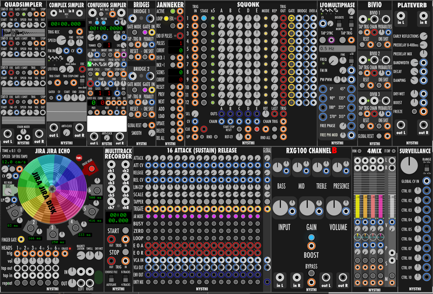
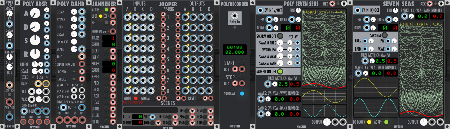
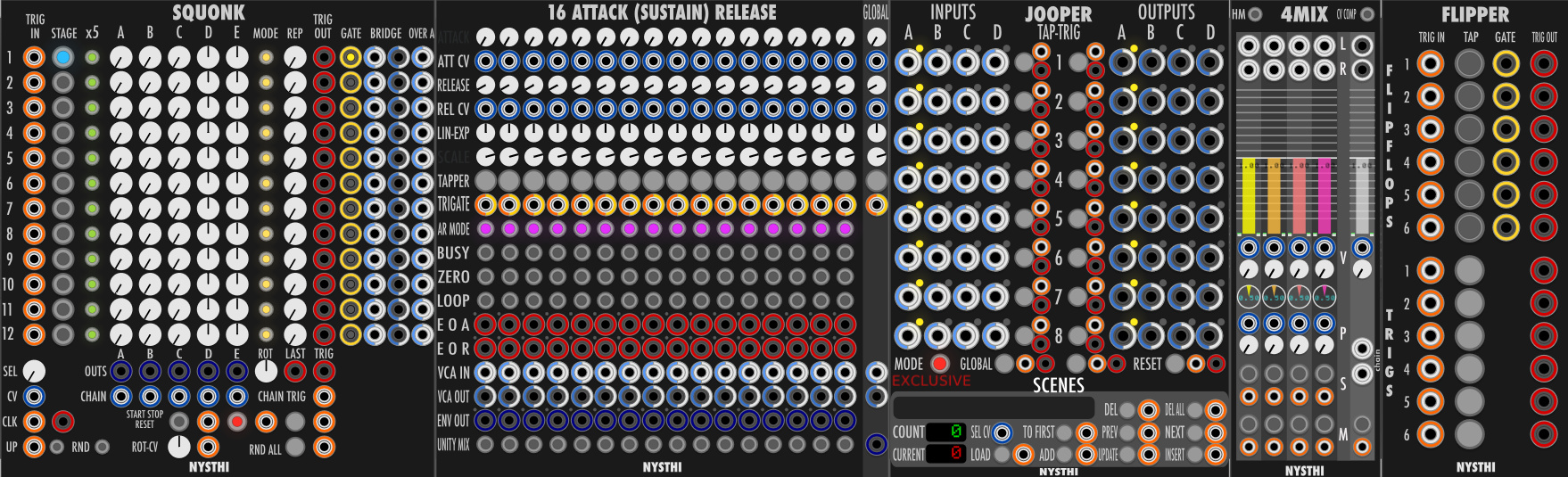
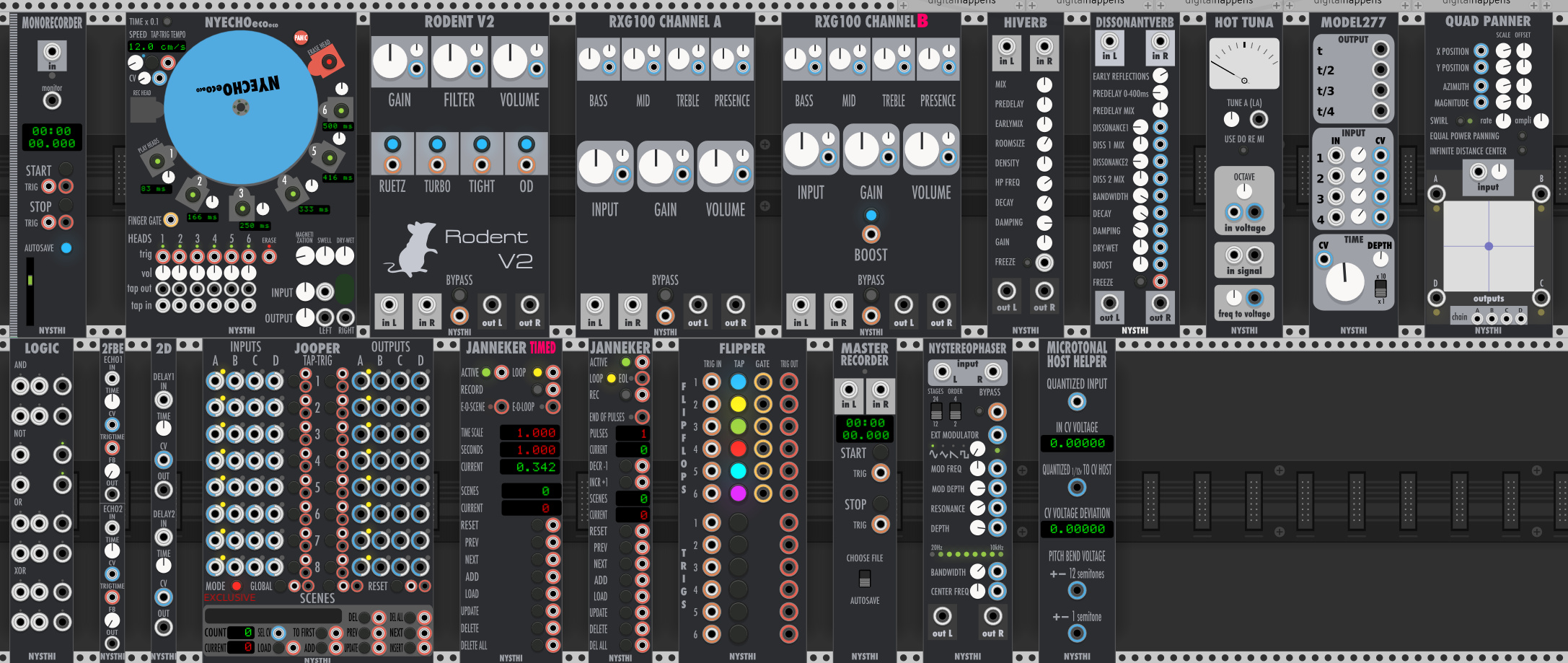
Ok, here’s my final take on NYSTHI Dark. I did all the modules (took most of today), including changing the ports for a more consistent look and even playing with the tapper buttons a bit in the last revision to make them more legible. It’s at a point now where I’m pretty much happy with everything. I sent Antonio a link to the resources if he wants to use them.
No big deal if not, I did these for me. If Antonio is ok with me sharing, I’d be happy to post the link, otherwise again, no biggie.
Here’s the final preview:
this looks really great, hope you get the permission!
I was thinking about blue as well and maybe even using the ones from Squinkylabs but I will definitely take a look at Pyer’s. I’ve only done those two modules so far but I should be able to do the rest pretty quickly, will have a try tonight and upload for you.