it’s a recurring theme on the forum, people asking for dark themes for their favorite modules, admittedly some modules look great just because they’re dark
The other day I was setting sunvox on the phone, giving it a dark appearance and I noticed that it didn’t seem to have a beneficial effect, I began to notice some eye irritation and fatigue.
a quick search showed results where it is stated that despite the dark themes are beneficial for the eyes, if not on the contrary, in certain conditions we should avoid it
I use dark mode on some applications. But it isn’t about the brightness so much as the contrast.
I have a condition where high contrast causes me issues, and so I pick and choose the best scheme that an app offers, which is sometimes the light one.
What’s irritating to me is that many operating systems offer high contrast mode for people with poor vision, but low contrast needs are not catered for.
I agree on the contrast.
It’s not so much a speech
of a white background with black lettering or a black background with white lettering, both combinations tire the eyes. The ideal is a grayscale. Dark gray (not too much) instead of black, light gray (not too much) instead of white.
In addition to the discourse of contrast, I think we are human beings, not machines. Each person sees colors slightly differently, and this also applies to hearing, each person hears things a little differently.
Noise that might bother someone may not bother other people.
Color that may bother someone may not bother other people. So there is no need for articles after articles, everyone feels when their eyes get tired and when they don’t.
I tend to tire much more easily with predominantly light themes, then if any scientist has proven otherwise, they certainly never took my eyes into consideration.
I’ve never understood the appeal of dark and/or grey software environments. I suspect that there’s a degree of lowest common denominator which says that greyscales will jive with more people’s aesthetic sensibilities than any possible bold color schemes - not unlike with hardware modules.
My eyes do better with contrast, but I prefer contrasting colors. It’s easier for me to distinguish brown and green, orange and teal, fuchsia and lime. For example, I’ve just installed Live for the first time in a couple years - and was delighted at how easy it was to ditch the grey. Themes FTW!
I don’t know why black, I always thought it was better for vision, but apparently it’s not true, instead if I can say about the gray tones of some software, this is to provide a visually neutral environment, this is common especially in the design software.
I can see dark/black being better for playing in the actual dark, like live shows in a club, for instance. I’m a night-person but I still try to have my room fully lit. When it’s getting late for me I just cue some files or streams and switch the monitor off anyway.
Colors and themes have been on my mind. Live’s UI elements are pretty-well mapped out, and I am thinking of mapping the graphical bits of Max so I can port over the colors of my fave themes from Live. There’s a big overlap of users between the two programs, so I was surprised to find that there are hardly any Max themes.
As for Rack - I am just getting back into this also, coming back after v0.6. I just embrace the visual jumble of styles. There are too many for me to bother re-skinning them, and the UI layouts differ drastically. I love how some are too dense to exist or use as physical modules. If I want a more uniform and/or organized graphical experience in Rack I’ll probably do that through mapping hardware controllers and TouchOSC. So I’ll be mostly patching in the light and then play “finished” patches in the dark.
Better or worse is pretty subjective. For me, when staring at a rack for hours, dark panels are more relaxing on the eyes, especially at night, so I do prefer those but can use both, as long as there’s good contrast and legibility. A big, bright, lit up screen can be like staring into sunlight after a while.
even ‘back in the day’ when monitors routinely used green, amber and white (I preferred green/amber to white) on black. when windows (Mac/pc ) turns up, white background became more common.
but still programmers code editors often have options of this white on black, which felt better when using for long periods of time… though not sure how many used this, as the default usually is white on black.
as an added advantage, in modern editors, I find that for syntax colouring, colours ‘pops’ a little more with a black background.
but no right or wrong, whatever works for you…
as for vcv, I think it looks ‘prettier’ in colours on black (as I said colours stand out more) , and for the evening its great.
I think black just looks so good too… a few in eurorack change all their panels to black variants, and it looks fantastic
I don’t care either way, but VCV/modular is an also visual experience and I do like to be able to shape that. With regards to consistency, for instance.
Wherever it is available, while my eyes can stand it, I use it because I would assume it uses less energy and imagine it causes less screen wear. I don’t have a cell phone so this only counts as concern for (hopefully) longer term computer peripherals, for me.
I also prefer dark mode but mainly because I dont like the fact that you can’t properly dim those LED screens (also on phones) to a point where I can endure it in a darker environment. My iMac at the lowest brightness still illuminates the whole room… and the accessibility features that dim further often just lower contrast / white point so it looks bad and that’s also no fun…
I generally prefer black on light grey (and really do not get why my wife prefers the dark theme for Facebook), but sometimes I like a dark theme to follow moving LEDs and such, like with some of the Geodesics modules.
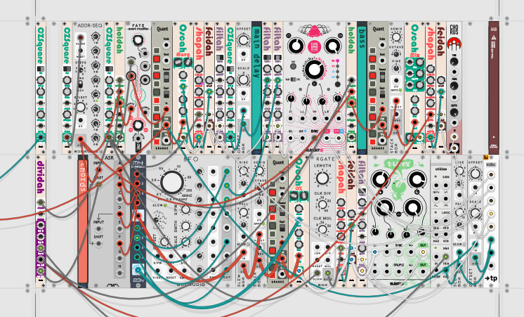
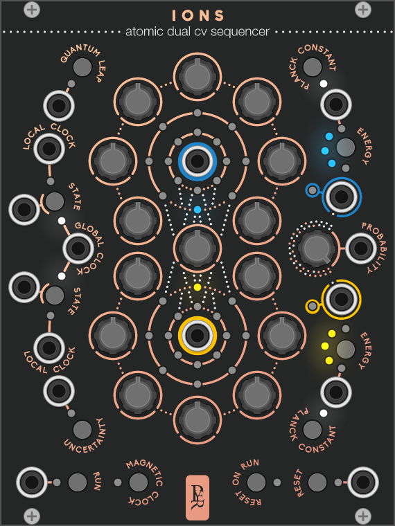
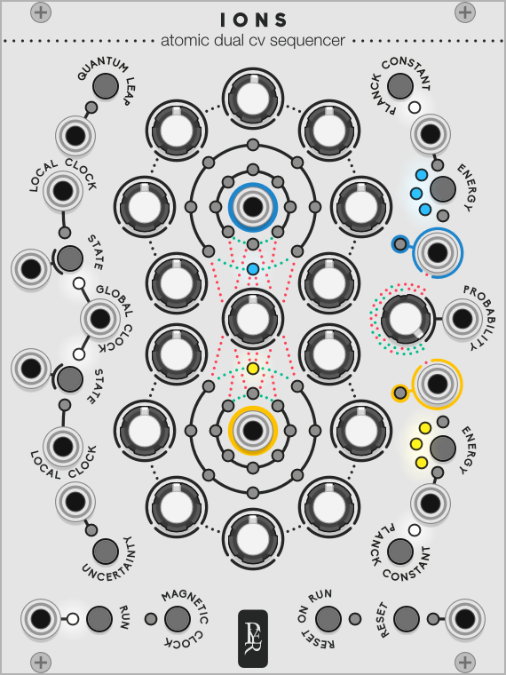
Compare this:
to this:
All those teeny grey dots in the circles light up to indicate the progress of the sequence, and I find them easier to read in the dark theme.
dark theme is a must for me for any screen use. i am slightly light sensitive, and staring at white screens gives me eye fatigue and eventually headaches. i can use dark themed applications for hours without problem.
With my next module set I think colours will be based on the theme. Programming colours based on contrast. The chroma (colour wheel) is not yet available, as luma (white level) is under experiment. Modules can as of 2.3.0 get the theme and brightness of the lights. How would people like modules to be shady?
When going dark mode it is as if the contrast increases. So, the ‘whites’ get toned down, yet still stand out. So you go solarized. Not enough, do more, do more… in the end it all crumbles down as a Giacometti statue. Dark mode sucks!
So, what to do? First, reduce the brightness of the monitor, it also reduces energy use (battery life). Then use an off white background, a soft yellow works excellent. Old skool writers use yellow paper and a pencil for a reason. Painters start with a light ombre or yellow layer first. Then the under painting is in grey & brown tones. #FFFFF3 would be about the lightest background I’d go for and a dark gray font on that.
In the days of old, with slide projectors we used off-white on blue or better, yellow on green. The old fashioned amber computer screens worked quite well also.
An other trick is to switch to black & white (on windows CTRL+WIN+C). Again, in the days of old, we designed everything (lay-outs) in grayscale and only in the last step converted to colour. It gives a better view of the total balance without colours drawing attention.
Finally, make sure your room/environment isn’t darker than your screen.