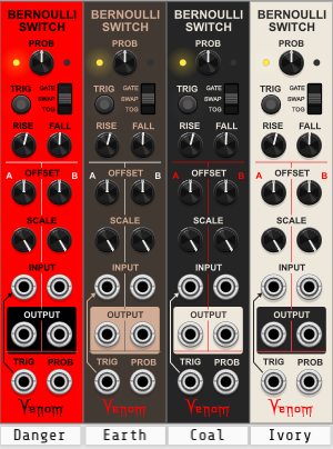
The biggest change is the added support for themes - there are 4 to choose from:
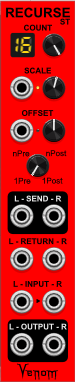
I have also added RECURSE STEREO - a stereo version of the RECURSE module.
Technically the original RECURSE module is no longer needed, the stereo version is perfectly happy processing one input and output using the Left channel only. The stereo version uses a tad more CPU, but I think it is inconsequential. I also think the stereo version may be a bit more confusing if you don’t use the stereo capability. I’m curious, what do others think? Should I keep both versions? Or should I just have the stereo version and rename it to RECURSE?
I’ve also enhanced the behavior of the Rhythm Explorer Mode buttons and CV input. The CV now updates the displayed value in the buttons to give you visual feedback. I also fixed some bugs in Rhythm Explorer.
Now that the themes are in place, I hope I can get some feedback as to the functionality of the modules. Which ones have you tried? Are they useful? Are they working properly? Is the documentation clear? Or any other feedback is welcome.
Unless I get reports of some bugs or significant design flaws, I think I am almost ready to submit the plugin to the library.
Thanks - I absolutely agree. I was/am inclined to remove the original version. It’s just that I have seen a number of plugins with similarly redundant modules, perhaps because the “redundant” module was introduced in a later version, so you wouldn’t want to remove the old form.
But I was/am just curious if there is anyone that would prefer to have both.
I prefer to have both single and dual. Helps reduce clutter, increase productivity / focus I think, to only see the channels I use. If the load is reduced using the mono version, I’ll accept that as a bonus.
Thank you for creating these modules, and making them available free-of-charge and open source to learn from.
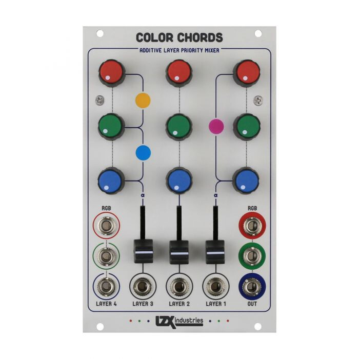
Nice modules about colors, Many great devs 'painting" theirs face plate to create a brand image, but as seen on the two examples below (both using pretty much the same colors just in a different way) sometimes you just need small touch at the right place to have something that stands out but still being well balanced in a larger thing
I really like the Coal and Ivory version for these reasons.
We make “plugins” that are part of a big rack over which we have no control, so I guess if one wants to stand out by being colorful, it’s cool but we have reconcile this with the fact that we are only making small bits of a bigger think that is not ours
I like the way these modules are pretty dense, but still usable. A couple of things seem non ideal to me:
The jacks have the labels on top, but the knobs have the labels on the bottom.
The font used seems to be a bold all-caps font? Seems a little less nice that other modules. Of course many modules use fonts that are very small.
I don’t think Venom Classic should be the default theme. Most ppl will find this quite ugly (imao). Having watched discussions online a lot, I think your default should be one of the dark themes. Some ppl hate light themes, very few ppl hate dark ones.
Whereas I con understand these discussions regarding panel aesthetics, one of the cool things about the Eurorack “standard” is that there is no appearance aesthetic standard. Seems to me that it should always be up to the developer to define their own personal aesthetic. But then, some users will choose to use some modules and others will choose not to, based on their personal aesthetics.
That is only in the VCO, which is incomplete and will not be included in the first release. It is an artifact of its heritage - the 21 kHz Palm Loop. If and when it does get completed and released, it will have a faceplate redesign and will certainly be designed to be consistent with the others.
I think this is a case where I may remain obstinate - it is simple enough to change the default theme such that you never need to see the garish red again. I suspect very few people will keep danger as the default, but for some reason I still am attached to that design.
well, they are your plugins, so you are the boss. I can tell you from a lot of experience that many ppl will just see the “ugly” theme in the browser or in the library and skip over them. But again, totally your decision.
I have a background in visual stuff and I’m always very happy when I can use those modules that let me build a coherently looking patch. I would even wish for VULT to release a - 𝕾𝖆𝖈𝖗𝖎𝖑𝖊𝖌𝖊 - light version. So, especially utilities which scream look at me! and those collections that are perfectly 2D, yeah, Nah. BUT weird modules, which sonically might be also the star of the show? Go crazy, devs
The idea was not to go to some kind of conformity, I was just suggesting the importance of the meaning of colors. Sure there is no standard and one can use any colors, but one can’t ignore that most modules are black or light grey. So if you want to make a red module, good, but by doing so, you are making your module the center of attention, intentially or not. If it’s a badass filter you want to tweak live, I get it. If it’s a utility module that you would set and forget like a logic module, it’s kind of counter productive. People think colors are about easthetic, but they create high or low zone of contrast and thus creates zone of attention for the user. Colors are a bit about aesthetics and a lot about user experience. That’s why I like in the Color Chord module and Venom’s Coal and Ivory themes: they use colors without creating unintential attention center, in that way they are very balanced
Just being the devil’s advocate, do your ideas on this apply in the Eurorack hardware environment? Looking at my extensive hardware rack, there is very little use of colors other than black, white and shades of gray. The Mutable Instruments modules are an exception with their color knobs and text. Looking at my hardware rack, I can easily focus on an individual module as each module brand tends to have it’s own fairly unique use of black and white and gray. Yes, each is drawing attention to itself, but personally that is a plus in the hardware modular environment.
Why would this be different in the virtual modular environment?
All of this seems extremely subjective to me. In my subjective value system, I rank my values from highest to lowest as: reliability, functionality, usability, flexibility and interoperability. The color scheme doesn’t even play a role for me, but I have close to normal vision. Someone else would have a different hierarchy of values.
It is difficult for me to see a way out of the subjective values issue regarding color schemes. Perhaps a workable scheme is for the developer to default the module to the developer’s preferred color scheme, but allow the user to change to a light theme or a dark theme and allow the text contrast to be varied. Of course that is my method for Meander, so I am catering to myself at some level, although I catered to users in creating the dark them alternative and add contrast adjustment such that each user can find a comfortable panel look.
This isn’t a big thing to me, but this is my two cents anyway.