Somebody should design a new module browser?

At work we used to have a joke that there were so many suggestions around of the form “somebody should”. We eventually created an email list in the company called “somebody should”, and we would encourage people to send email to it. The “in joke” was that there were no subscribers to that list :wink:

Anyway, there is so much talk about people’s desires for a a better module browser. Maybe some talented people should get together and design a better one. Complete with mock ups. Even some form of “user testing”. Would be better with more than one person, but maybe one person could do it.

Of course it could be a huge waste of time…

FYI - I am not proposing that I be involved in such an effort.

5 Likes

And you are thereby demonstrating the true spirit of somebody should. :laughing:

If only I could code…

I don’t know if the proposal comes from the thread https://community.vcvrack.com/t/adding-several-modules-at-once but @pachde made some nice suggestions regarding multi-selection:

Well, I’m saying that if someone make a complete design for a new module browser it would a) be something that some developer would choose me make, and b) it would be a nice tangible example that could be used for discussion and possibly to influence VCV in the future.

I’m not a very good product designer by any means. It’s quite difficult to design and specify what all the keys and menu items should do, what state the UI might be in, how it responds in different states, what its remembered permanently, what is remembered for the current session, what should happen in the various edge cases.

So - maybe someone who is good at this will make such a design. Then maybe (or maybe not) some developer would implement that.

Yes, or at least that’s the joke part of my post. The non-joke part is what I told @damoga - that I am not remotely qualified to do it. And I don’t have the passion for trying to solve that problem. But I’ll bet “somebody” has the ability and motivation to do this.

1 Like

So I took the plunge… :laughing:

Please don’t see this as anything but an exploration. I made a lot of assumptions that need validation from this community as I have been in no way taking everyones workflow into account. I have been paying attention to most threads on here, so I hope there’s a couple of nice additions you’d appreciate.

Main Assumptions

  • Search is the most used feature and this design implicitly calls for an upgrade =)
  • Most people use screens with wide aspect ratios, so we can get by with a sidebar, without losing to many modules that are shown at the same time (there’s still zoom options)
  • The tags are used more frequently for filtering than the brands, so I opted to “expose” this fixed set of options
  • User Tags are a popular request and should be managed directly from the browser
  • There will be a module “hiding” feature in accordance to the latest discussions around plugin vs. module subscriptions
  • Its more like for things to be implemented and appreciated if we keep some things the same (muscle memory)

There’s still a lot to figure out interaction wise like selecting and deselecting modules, tags and how to implement the above mentioned multi-select.

I opted for a Detail View as seen in the second screenshot, because I felt like the info from the library website could be nicely integrated into the browsing experience.

Please discuss freely, even though we’re not sure something like this will be on Andrew’s To Do List.

Full size screenshots: VCV Browser Redesign - Google Drive

19 Likes

Nice effort so far. My main issue with the current browser is needless scrolling when selecting brands, even on a giant 4K monitor. The sidebar would help with that considerably.

3 Likes

how would scrolling through brands be easier? Are you imagining that you could see more that one brand per row?

1 Like

ooh, thanks for wading in! couple of questions:

  • some ppl wanted a text only view where you could either fit more on a screen or draw faster, or both? Most apps I’ve used have multiple views onto “here’s all my stuff”.
  • can the sidebar be made wider by dragging?
  • does “reset all filters” really need to be visible when there aren’t any filters?
  • what’s going to go into that gear / settings thing?
  • do you really need “view vcv library”?
  • why are there yellow rectangles around each module?

Of course will be interesting to see the rest. (what does hiding / un hiding look like, what happens when tags needs to scroll, etc…

nice!

1 Like

Hmm, “why are there yellow rectangles around each module?” - not every module, only the ones that are chosen as favorites. There are several modules in the screenshot that aren’t favorited. It works like that at present, too.

2 Likes

ah, tx. I’ve never used the favorites feature :wink:

Hehe, I figured this must be the case, yeah :smile:

1 Like

Thanks for taking up the challenge.

I think it just continues to signal our contempt for present browser.

Your ideas are looking good.

2 Likes

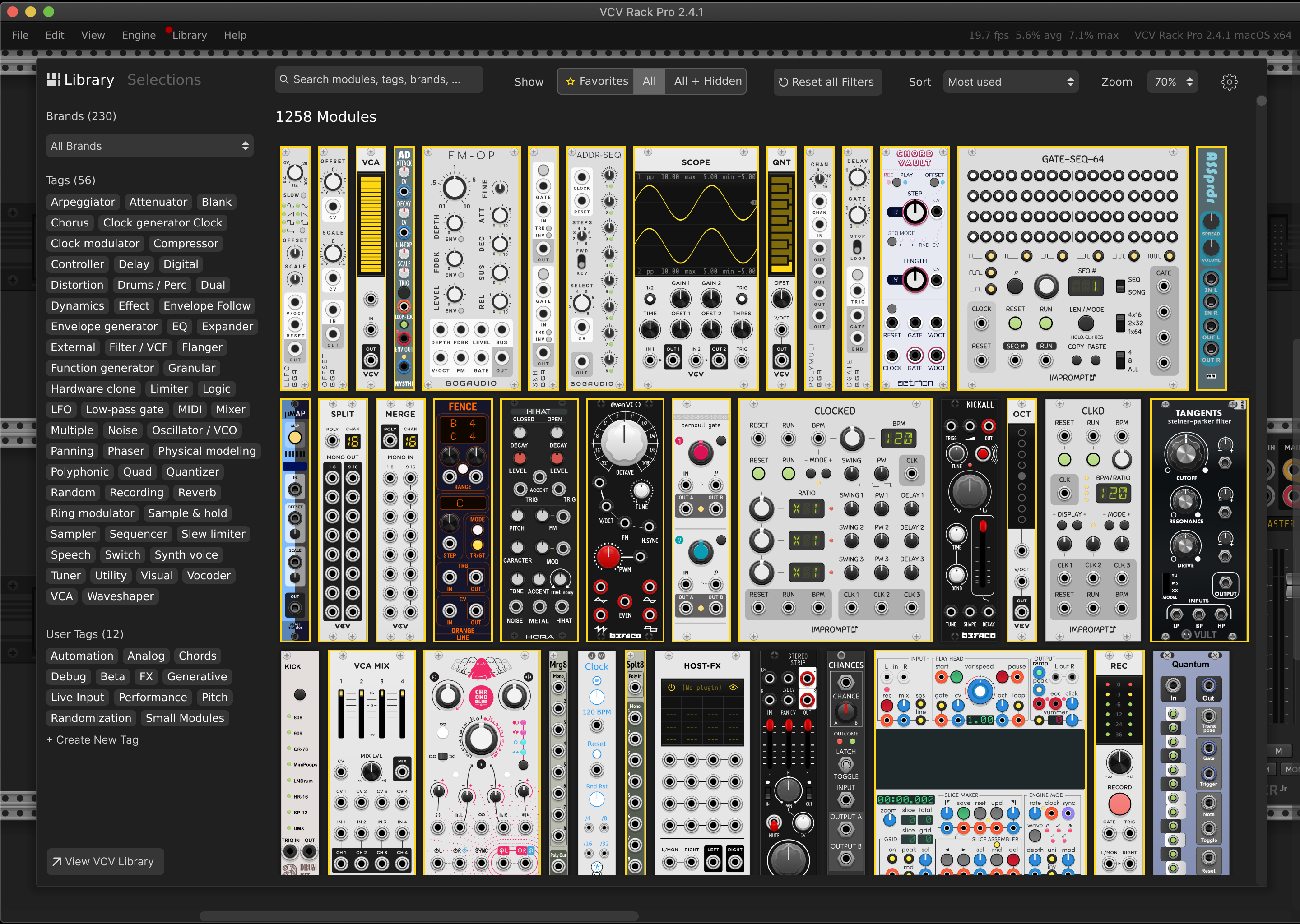
I find that tags being made visible is really clever. With enough time users will get the hang of whats where on that list, and speed up “looking for module by tag” workflow. Though, if the sidebar is able to change size, the list items locations would change…

Regardless, click scroll find click is FAR less efficient than find click. So i think thats a great improvement.

Splitting up user tags spatially is clever too, makes user tags much more easy to navigate, and far more compelling to use to its fullest.

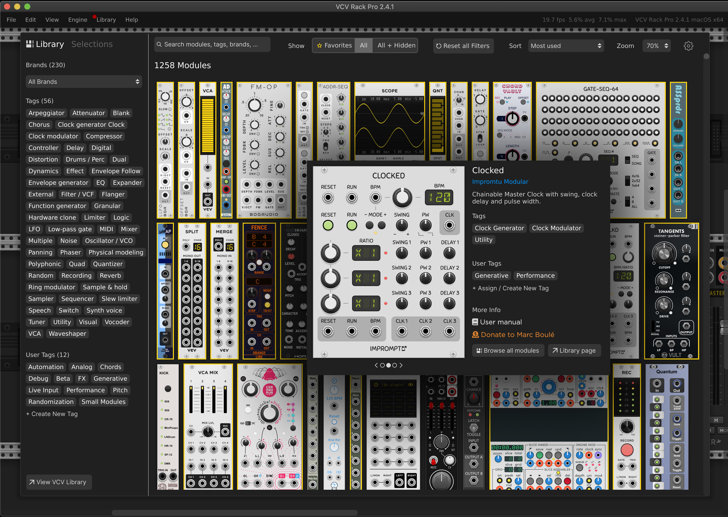
the exploded view of a module with description and tags is charming too, maybe a right click function??

Possibly reset tags could be called “deselect all tags” or something to that effect and live in the sidebar below the tags section… Maybe a setting in settings section could allow user to choose whether tags persist or auto deselect every time you open browser…

I find that the search bar being my main (and potentially most users) main used feature, it could get more real estate

Personally i pretty much exclusively use the search bar; to search for modules types (ie. typing “env” for envelope generators rather than clicking into the filters) or to search for specific modules. I have only rarely used favorites tab. I think a hotkey to enter favorites would make that a much more viable feature.

Basically the way i see it, when i use the browser, i usually click once, to choose the module. I think most users will not use features that require multiple clicks unless: its adds new utility, or speeds up a process (removes need to type), or both. So i think tags being immediate makes that much more useable from a ux standpoint.

Id be curious to see what you might imagine the text browser to look like, i was not around for the text browser days so i never grew fond of it like some around here. I bet some of them would have clearer ideas of what makes that work best.

1 Like

My only hope is that selections will be incorporated into the browser somehow. I keep on trying to open them there… :pensive:

3 Likes

Agreed! Selections are so worth menu diving for but would be soooooo much more amazing built into the browser for sure.

Happy to!

Thank you for continuing the discussion with a handful of questions. I can follow up on (slightly longer text I am afraid)

  • Regarding a text only version of the browser, I think the blueprint for that is pretty much set by the browser in the older VCV version, and the optimized UI from MB by stoermelder. I am all for giving people choices, so this is something that could definitely go into the settings that are meant to be sitting behind that cog wheel icon.

  • I would suggest for the side bar to stay at a fixed width, prioritizing muscle memory (tag location) and number of modules being displayed on the right side.

As for your other points I fully agree:

we don’t need the reset button unless something has been typed into search or some of the filters have been used. I am also not too happy with the positioning as of right now, because it might be too far off from where you are with your mouse when you’re using the interface.

We also don’t need the link to the VCV library to be as prominent as it is right now, Especially if there’s a way to navigate to a specific module of plug-in in the website library via the detailed view.

It’s been a first draft and I am open to creating a version 2 after we’ve collected some more feedback.

1 Like

First of all, thank you for your detailed response.

My browsing behavior is very similar to yours with search being the main way to go and using the first 2 to 4 letters of a module type or name to narrow down results.

However, as my module library constantly grows, I still have to rely extensively on the favorite function to have a visual queue when trying to find a specific module and search can take longer than I would like to. Scanning the modules visually to find the right one is sloooow.

So there’s a chance for speeding things up if you use user tags or a combination of search and tags/favourites.

From a UX perspective, I think speed of selection (if you know which module to add to your patch) and a more informed choice (trying to find a module for a specific purpose) are the two main goals of a redesign.

For a moment, I even thought about the module browser as just a Google like search field, coming up in the middle of the patch window similar to the spotlight feature on macOS. That might be a bit more extreme and restricting though.

2 Likes

Nice try, it looks good! The very first thing I thought looking at the pictures was “what if the library was restrained to half screen and I could drag and drop modules to the rack?”

2 Likes

Even better yet, a floating menu that can persist and be dragged to a second monitor!

3 Likes