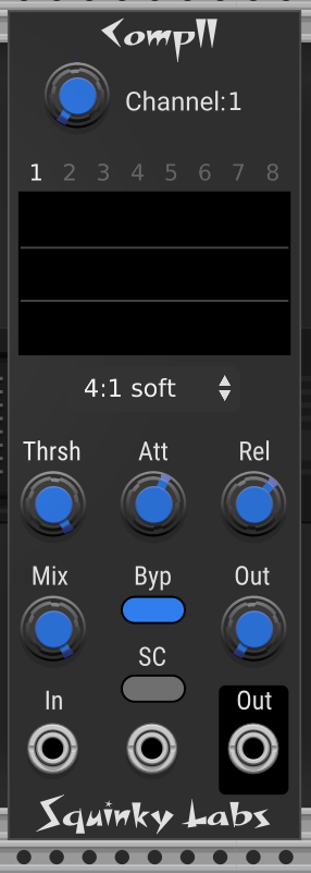
Now that you mention it, the text is very difficult to read, which is a pet peeve of mine. Not only is the text small, but the color doesn’t provide much contrast.
I like to be super legible, so I usually use the Roboto font, full white (7f7f7f) and 12 points.