I had an idea for how to do theming with nanoSVG, and spent some time doing basic research and writing it up.
Here’s the detailed notes: SVG Theme Notes
If there is interest from others, I might try an implementation and make it available in a reusable form.
With this scheme, you operate on a loaded SVG, and apply a stylesheet written in JSON that matches SVG elements by id to change colors. Very simple and lean. The SVG remains editable in Inkscape. There would be helpers to add a Theme menu with options for each of the themes you define.
I’d personally be very interested in this as I’m (slowly) building two modues and have been thinking of themeing options. The first being a v2 implementation of an old v0.5/6 plugin that would have different themes.
The other is an alternate firmware port of a well known module that would have completely different panels with maybe some additional colour options for each of the panels.
The original Rack version of Surge did similar to what you’re proposing but with an XML stylesheet.
new version does basically the same just i don’t serialize the color choices to xml but keep them in code.
I definitely used to change SVG colors though and it worked great for those assets. Basically you can just traverse the svg object and whack whatever color you find in the tree. With the new version we really minimized our SVG usage though. Just a few knobs and background panels and the rest we paint into FrameBuffers using a frame buffer lambda class
I think it’s pretty much ready for production, but I’m sure that thought is a brief bit of hubris that won’t survive first contact with real developers. If you run into a problem, I’m listening, and if you find a bug, please open an issue on GitHub.
I ended up using two header files. One for Rack-independent nanosvg theming, and another for helpers dependent on VCV Rack.
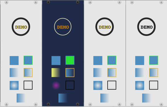
The Demo is a complete working plugin implementing a single Blank panel, backed by an SVG using standard Rack SvgPanel class. The demo also includes an example of a theme-able widget. In this case, a theme-able version of the standard Rack screws. Applying the Dark theme gives you the look of the Rack ScrewBlack, and the Light theme is the look of the Rack ScrewSilver (with one Screw.svg).
The demo shows how to theme a stock widget, and also how to implement theme-able widgets that can all be updated to a new theme with one line of code.
The Theme menu in the module is created by calling another helper that does all the work for you. You just implement a trivially-implementable interface on your module widget.
I don’t actually use it in my current modules, but I learned good stuff making it. Others have copied the source and built on it to do different things.
I’ve run into some difficulties / confusion that I’m hoping you can clear up for me. I opened an issue on your github so as not to clog this thread, but it basically boils down to the display of different instances of the Demo module being affected by the theme chosen in another one’s menu.
I don’t know yet. I didn’t see anything obvious in the code, which is quite simple. My hunch is something surprising about how modules are duplicated, or an interaction with Rack SVG cacheing. Probably the SVG cache, which is seeing the same filename, not knowing that this module is modifying the SVG at runtime.
We understand the problem now – all a combination of Rack’s SVG cache, and that we modify the parsed (shared) SVG in the cache. This will require a new approach (basically create foo-theme.svg so that each themed variation gets cached separately), but it’s doable. Details in the issue thread.
I’ve started working on an update that will be making further changes in the logistics and caching, which should be more efficient and avoid some of the issues the current scheme has.
I am adding a second module to the demo with themed ports, knobs, and switches in addition to the module panel. Some of the entities move from module to plugin scope, for sharing themed svgs among modules in a plugin.
If all works out, themed svgs won’t exist in the global rack svg cache, or maybe only the default un-themed ones. This should prevent the odd runtime mutations that have been observed.
Unfortunately this is all breaking changes, so I’ll need to write some migration docs.
Yes, I noticed that as well, and came to the conclusion that it’s because Demo.svg doesn’t match either theme.
If you bring it up in Inkscape, you’ll see “DEMO” in black. However, you can’t get back to that state by applying the demo themes.
In detail:
When the demo module loads, the theme code does nothing if it thinks it has the default theme (Light). Since nothing has happened, this shows “DEMO” in black as in Demo.svg.
You apply Dark, and Dark logo-text is applied to “DEMO”:
Next version could prevent this effect by always applying and not being so “smart” by assuming the base svg is identical to “Light”, which by accident isn’t the case in the Demo. Since this prevents a class of issue, it’s either always apply or have a debug check for consistency. What do you think?