New module Fermata, for longer, wider, scrollable Notes

Since I’d already had to make a better text editor for BASICally, I’ve now improved that text editor and made it a stand-alone module, called Fermata (for longer Notes :slight_smile:) . Documentation is here. To be clear, it does no signal processing of any kind; it only does text.

There are two modes, depending on the width of the module. At the narrowest width, the title (which you set in the menu) acts like a label (in this case, “Heartbeat”):

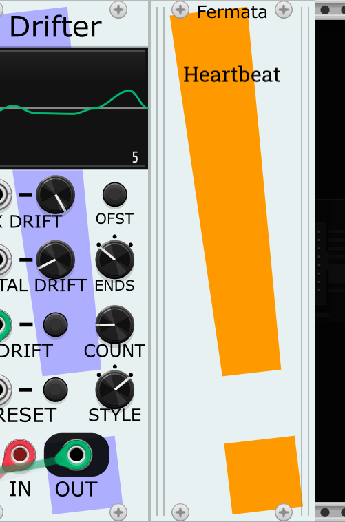
But there are little bars on the left and right edges for resizing the module; widen it, and the title moves to the bottom and the text editor/reader becomes visible:

Improvements over the VCV Notes module include:

  • Up and down keys do what you’d largely expect.
  • If there are lines above/below the visible portion of the text, the text will scroll vertically when the cursor gets to the top/bottom of the screen.
  • Width of the module can be altered just by grabbing the sides.
  • A small number of text/background color choices.
  • A small number of font choices.

Some ideas for how this might be useful include:

  • TODO’s or ideas on a patch in progress.
  • Instructions for playing the patch.
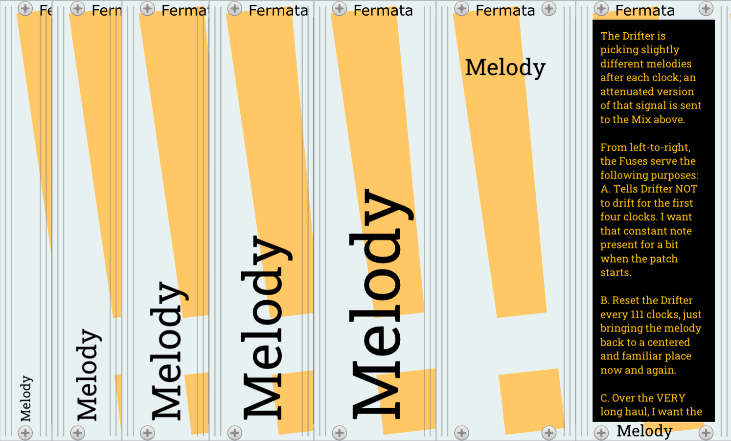
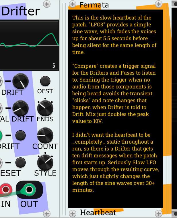
  • Notes/reminders on how this part of the patch works, to remind future you how it works. Useful in a teaching environment as well. Here’s one example of how one might do that.
  • Writing a short story or epic poem while listening to your patch.

I hope this proves useful to the community. Love to hear your thoughts.

Mahlen

24 Likes

I gave Fermata a test drive. I love it! Great job.

Wonderful - thank you!

We finally have a notes module that does not change the text layout as you zoom in / out. :smiley: :+1:

I have some minor aesthetic change requests, but I understand if you don’t want to change anything

  • Offer an alternate plain skin so the border does not distract
  • Option to swap the module name and title, with title at the top, and module name at the bottom.
  • Maybe offer a vertical scroll bar for long text. Auto scroll as you type and navigate with the keys is fine while you are editing the text, but not so good if you are simply reading.
2 Likes

I really like what’s been done here.

If you have a long text, it’s arguably better to resize the module to show all the text without scrolling, so you can refer to the whole thing while you’re patching. This has it’s limits of course, and ultimately some kind of scrolling is useful. My cutesy idea: click the top/bottom screw to page up/down.

I see that VCV’s resize handles visual from Notes Blank has been used verbatim.

Great ideas here for yet another notes module that I’m working on. The hide-show title mechanism is neat. but not sure I’ll copy it. As with the other modules I’m designing, mine is a very plain skin and might suit some of @DaveVenom’s desires.

I wonder if it’s technically possible to make a generic extender so that you could use {left:name} and {right:name} within the text/title that when displayed shows the name of the adjacent plugin, and {left:version}, etc. for any standard module metadata.

VCV Notes has resize handles? I can’t find them.

I think @pachde meant the VCV Blank module, which was indeed where I lifted it from. It was the first resizable module I could find at the time when I added resizing to BASICally.

2 Likes

Hooray! So much easier than using the left/right keys to slog through entire lines of text.

I see also that it’s easier to click at any point in the text and then to drag-select it. :+1: With Notes the accuracy (of where the I-beam cursor lands) is only approximate and unpredictable.

One feature request that I have is to be able to collapse it further down to 2 HP and have the title flip 90° c’c’wise, to serve as a label for a group of modules or whatever.

2 Likes

Thanks for the kind words, all. Some responses:

@DaveVenom, I admit that the tilted-exclamation motif is pretty loud in this module. But, since it’s my branding, I’m also overly fond of it :slight_smile: I at first thought I could go loud because there were no knobs or controls over the “!”, but now I am considering toning down the color in this module a bit. Although I really like the way this shade matches the default “amber” text color.

You know, I initially put the “title” at the top, and it never looked right. This may be because (I say scanning my module browser) north of 90% of modules have the name of the module at the top. It was just confusing and weird to not have the module name there, even though I get why it seems better. So I’m going to leave this be.

Scroll bars encapsulate a lot of useful info (giving a sense of the length of the text and one’s position within it), as well as allowing one to quickly scroll through it. However, the way this TextField variant I’ve written works means I’d be best off implementing the visuals myself by hand; that is not currently a task I find myself relishing…but maybe someday.

@john_rose, if you look in the Related Modules section of Fermata’s docs, I link to some narrow “label”-related modules that do part of what you mention. Not, I admit, the same as doing that within Fermata.

@pachde, This morning I added support (for whenever the next releases is) for the PgDn/PgUp keys, which should really help scrolling. Home and End already go to the beginning/end of the document. I’ll be interested in what you decide to do for your notes module.

I would think that the {left:name} extender’s are possible, certainly. There are other modules that look to the left and right and do things based on them, for example cvly’s txt, which shows documentation for any cvly module it is to the immediate left of.

Thanks again, everybody.

mahlen

1 Like

@john_rose, @StochasticTelegraph - You’re right, I meant the VCV Blank panel: corrected (and found the notation for strikeout :-).

1 Like

OK, I’ve acted on some of these ideas, with some pleasing results. Not released yet, wanted to hear from you all before I commit.

  • Added PgUp/PgDown support.
  • Made the slanted “!” brighter, which makes them less prominent and distracting against the light grey background. (I don’t personally love these pale, pastel colors in my modules, but they do function within the environment better, in my opinion).
  • Supports resizing down to just 3 HP. At 8 HP, it shows just the title one word-per-line (in case of a looong title). At sizes 3-7 HP, it shows the title sideways, allowing you to make the title as subtle or visible as you’d like.

Here’s an image of an example patch where I’ve maximized the visibility of the titles:

And here’s the same patch, but shrinking down the widths to 3 HP.

The little slanty light orange “!” peeking out kind of says, hey, there’s a note to read here, but you can look at other things too!

I tried making the title vertical with a single letter per line (like a classic movie theater marquee), but it never looked tolerable, so not going forward with that.

Thoughts?

10 Likes

I welcome the sideways view.

Amazing. And it’s the right direction…from the bottom to the top, so I have to turn my head to the left like I used to in the bookshops.

1 Like

This thing’s looking good and useful

@StochasticTelegraph - I’m checking out your source code.

I saw your comment about refactoring the resize handles. This can be done without too much trouble. I’ve just finished doing exactly that in my work-in-progress plugin. You can see what I did: Paul-Dempsey/pachde1: VCV Rack modules (github.com).

My resize handles are invisible until you hover over them. When you do, you get a nice colored overlay on the live area. I also provide a resize cursor feedback on hover, which neither VCV blank nor Fermata do, and I think really makes it much easier to use and discover the functionality.

I have a long way to go on my plugin, but I have light/dark theming and resizable module support that I’m happy with. Next thing is digging into the text editing.

@pachde Your “pachde1” repository does not appear to be marked as Public, so that link fails at the moment. But once you’re live, I’ll be interested in trying it (with an eye towards lifting it).

My instinct runs against invisible controls, but maybe I’ll like it in practice. And now you’ve got me thinking that maybe I should put the word “Resize” on the control lines…

2 Likes

I love the big title usage, but I can’t get the width down below 8hp.

MacOS Ventura 13.3.1(a)

I can repro that as well on MacOS 13.3.1 (a) (M1)

Those changes will be in the next version, 2.0.11. Those screenshots and description were about work in progress.

1 Like

aha, all good then :slight_smile:

@StochasticTelegraph - Sorry about the link to a private repo-- it’s public now. To discuss details, I’ve enabled Discussions on the repo. Feel free to borrow anything that’s useful.