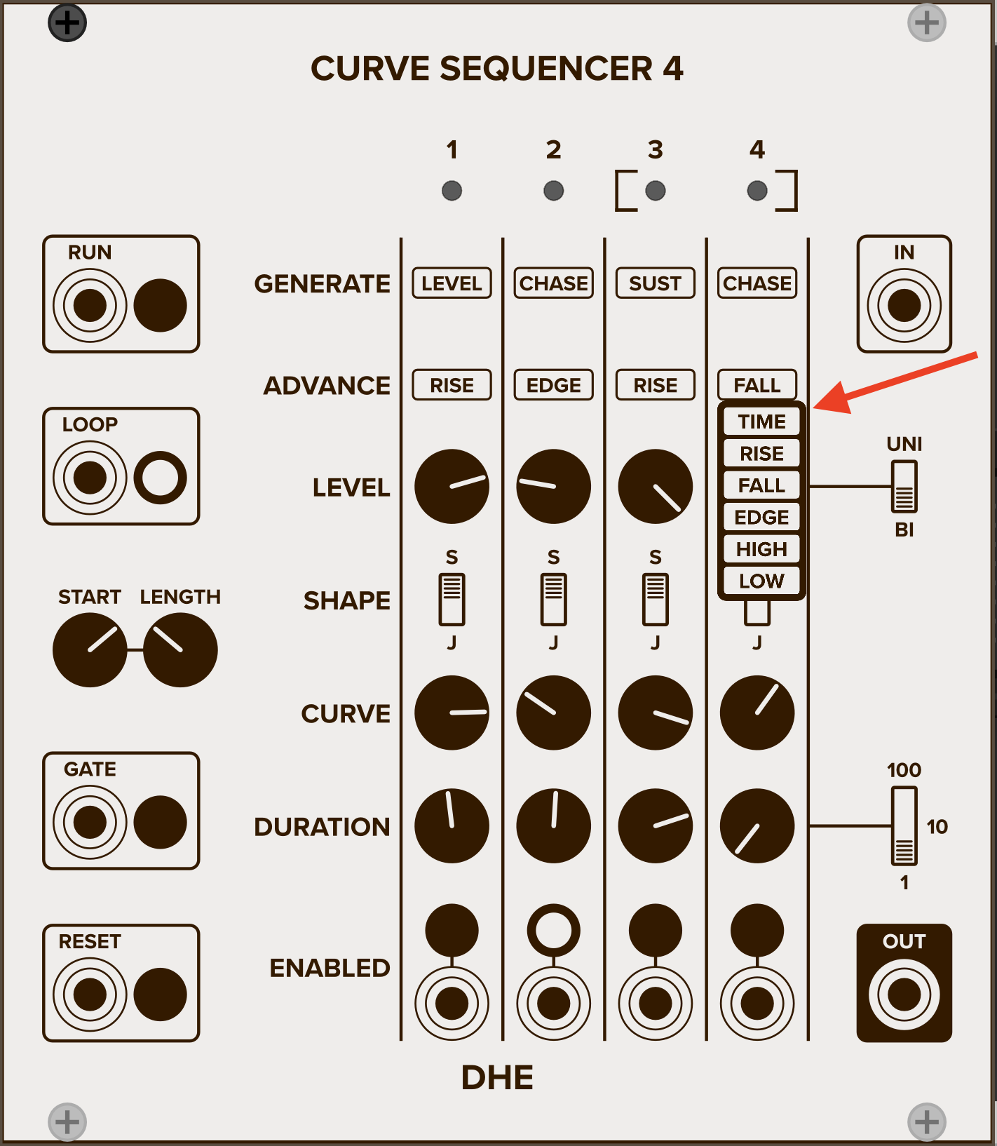
I’m developing a picklist control. It displays the currently selected option as a button. When you click the button, a menu appears with all of the options:
My question: Where should the menu appear? Above the button or below?
Currently I’m displaying each menu below its button, similar to most apps and GUI frameworks. But here it feels a little awkward to me, because (though you can’t see it in the image) the mouse pointer covers a bit of the top item.
Would it be better to display the menu above the button? Is below better? Does it make any difference at all?
I know I could also position the menu to the right or left of the button, or to the right or left of the mouse position. But then I have to deal with the (admittedly very minor) added complexity of making sure the menu doesn’t extend beyond the edge of the module. For my current modules, I always have room above and below the button.
I was going to suggest placing it on the middle of the button but 6 is not symmetrical, so it might look weird. Unless you place it on the middle and move the menu up/down accordingly, so it appears to be on the bottom when “time” is selected and appears to be on the top when “low” is selected. When “fall” or “edge” are selected it appears to be in the middle-ish. If the menu items had good symmetry it might look better, in which case it could always appear in the middle, placing the Y coordinates in an array and swapping the array index positions could help there.
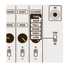
In an earlier design I centered the menu over the button. I quite liked the way it looked, even with the asymmetry. But the menu obscured the current selection. One way to deal with that is to highlight the current selection in the menu.
I could also (if I wanted to take the time) position the menu so that the currently selected option exactly overlaps the button (perhaps highlighted). We’ll see.
That’s where I started. There were two things I didn’t like about that:
The menu style differs from the module style.
The menu position overlaps or butts up against the button’s tooltip. And because the menu and tooltip styles are so similar, that juxtaposition looks a bit jumbled.
That said, those were minor issues. I may reconsider them.