I am developing modules for VCV. I have some modules almost finished. Sequencers, utilities a sampler.
I would like to find someone who can help me with the design of the panels. I know how to use Inkscape but I have really bad taste for graphics.
I am planing on releasing the modules and code for free on the plugin manager/github. So you have to be ok with that.
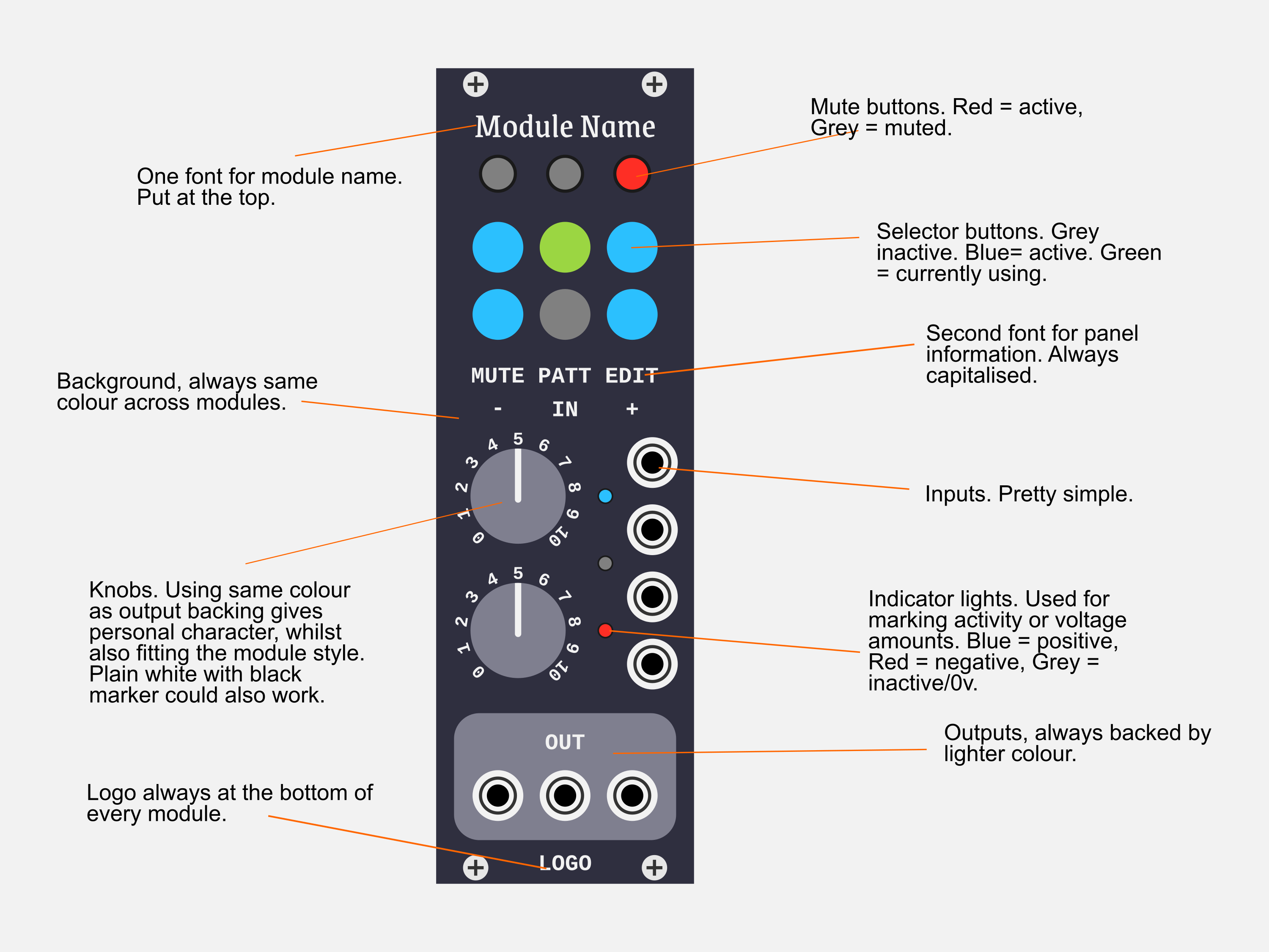
As others are saying, you have a pretty good start already. Having a bit more consistency over the range would help. You have a few different typefaces going on, where just 1 or 2 and using them the same way on each module would bind them together.
Some custom knobs might help you out, too.
You may even think about keeping a similar background colour, but not needed. I’m always a fan of the dark grey, though your greyish blue one might be a really good colour to give your modules your own personality.
I would at the least recommend a logo for your “brand” of modules to be put on all of them.
If I have some time in the next few days, I’ll see if I can put an idea together. But I would heavily push you to try it yourself, as you’re already on the right track. =]
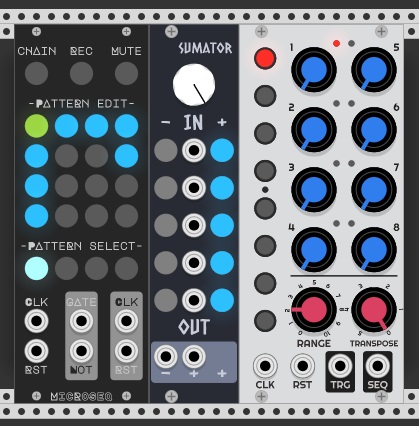
I’d have to agree here the three modules look like they’re made from different developers.
Keeping things consistent is the only sure way of making the user feel comfortable.
I like the colour of the sumator panel, but not the font. The font on the 3rd module is nice and clear but has inconsistencies with letter sizes, which messes with the flat design. The font on the first is not bad also, but the “R”, “P”, bold letters and module name are hard to read.
You have to remember the brain loves symmetry on the 3rd module you have “RANGE” “TRANSPOSE” I would probably shorten this to “TRANS” for symmetry or maybe “PITCH”. Also on the range parameter I would probably get rid of the in between numbers and use 0 - 5 - 10 or just 0 - 10 (your brain does the rest) the letters here are fairly small.
Here is a super simple mockup of something that could work. Just some design ideas slapped onto this thing. Feel free to use it as inspiration, or go another direction entirely. But it should help you look into keeping things consistent, at least.
Hey 6U - I’d love to help you with the designs. Send me an email and bwalowitz (at) gmail.com. We’ll chat about that the modules do and how best to brand/ design them. Thanks!
Hi, I’m a UX designer I’ve just released a UI library for VCV Rack module developers in order to make the design job easy for you guys, you can find it here:
Also you can contact me if you still need some advice to put the pieces together.
Cheers,
Wilmer (Almanacs)