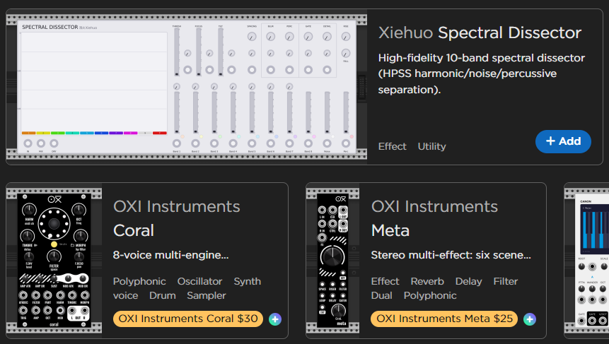
Sure, i’ll try! Well, first of all, I said “less readable”, not “isn’t readable”, so that’s what I will defend here. Also “and screenshot are all portrayed in a balanced way within the available space” - that absolutely misses the point of a screenshot provided, that was taken to illustrate that the comment I was responding to, wasn’t right, so I took a screenshot of a small portion of a screen.
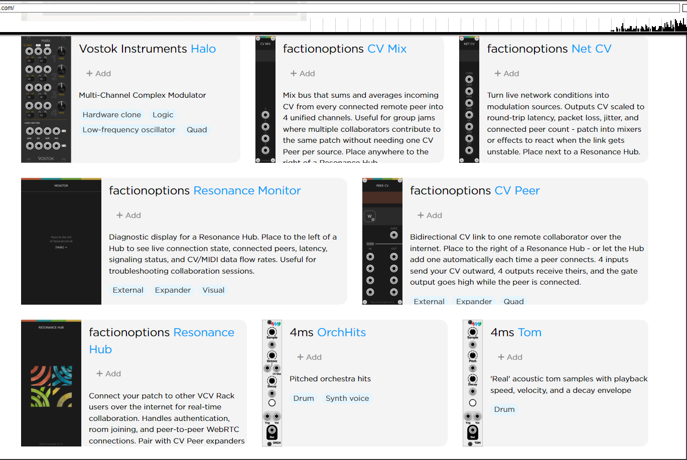
Now, why it’s less readable. Here’s a wayback machine screenshot of the whole page with smaller modules
Here’s this same segment, more or less with new design
I don’t know what to tell you, man… Tags had a bad habit to disappear in the old design in order to prioritize the description. That’s not good, but that’s not your fault either. People write poems there, I don’t know why, but it pushes tags out of the space dedicated for module’s description.
Well, that’s not what I wanted to show with this screenshot though. You see how free it is? I think the way to describe it would be “luxurious” or something. It’s sparse, yeah, but that improves the readability of a page overall. The sparseness is created, because each module occupies a lot of screen space, the tags are big (when they are seen), so if you have a poor eyesight, like I do, it doesn’t strain your eyes as much as when you read different fonts sizes in the same box (and I am not saying that everyone should optimize their sites for poor eyesight, but that gives an idea that if I feel it, and you don’t, that doesn’t mean your eyes are happy with it). Right now it’s like 4 different sizes. Which 2 would make sense, of course, the header and the description. But the +Add is a different size, I feel like (that could be an effect of a padding + bold font though), and the tags have different font size too. Also the images are smaller now - therefore, less readable too. The boxes feel cramped and forced into some kind of graveyard, as I said before. It really feels like what you see on some sites optimized for mobile devices. Cramped, easy to scan though, but hard to read. I hope I conveyed the idea, why it’s less readable. I also don’t like the bottom right +Add button, but that could be just a subjective preference.
What I like about the new design though is that it forces the tags to appear. That’s helpful, I don’t like poems in the description, I rarely read them.