That’s nice, they’re definitely words, I checked. 
Hello. Thank you for the new library. I really like it. Will the “number of downloads” value which showed in the table in the old library be coming back? If not, no problem. It’s just nice to see how many downloads my (minor!) plugin has had. Thanks again, Andrew. Very much appreciated and hope you’re staying well.
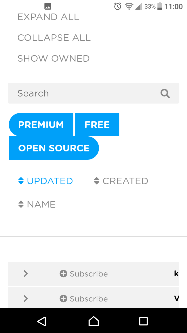
The subscribe on the left hand side has grown on me, I like, I can see why it is on the left! Though the view on mobile still needs some tweaking, particularly the thumbnail size and description/tag space for modules.
The size of the 3 filter buttons on the library page displaces one of the buttons
1 Like
Hi
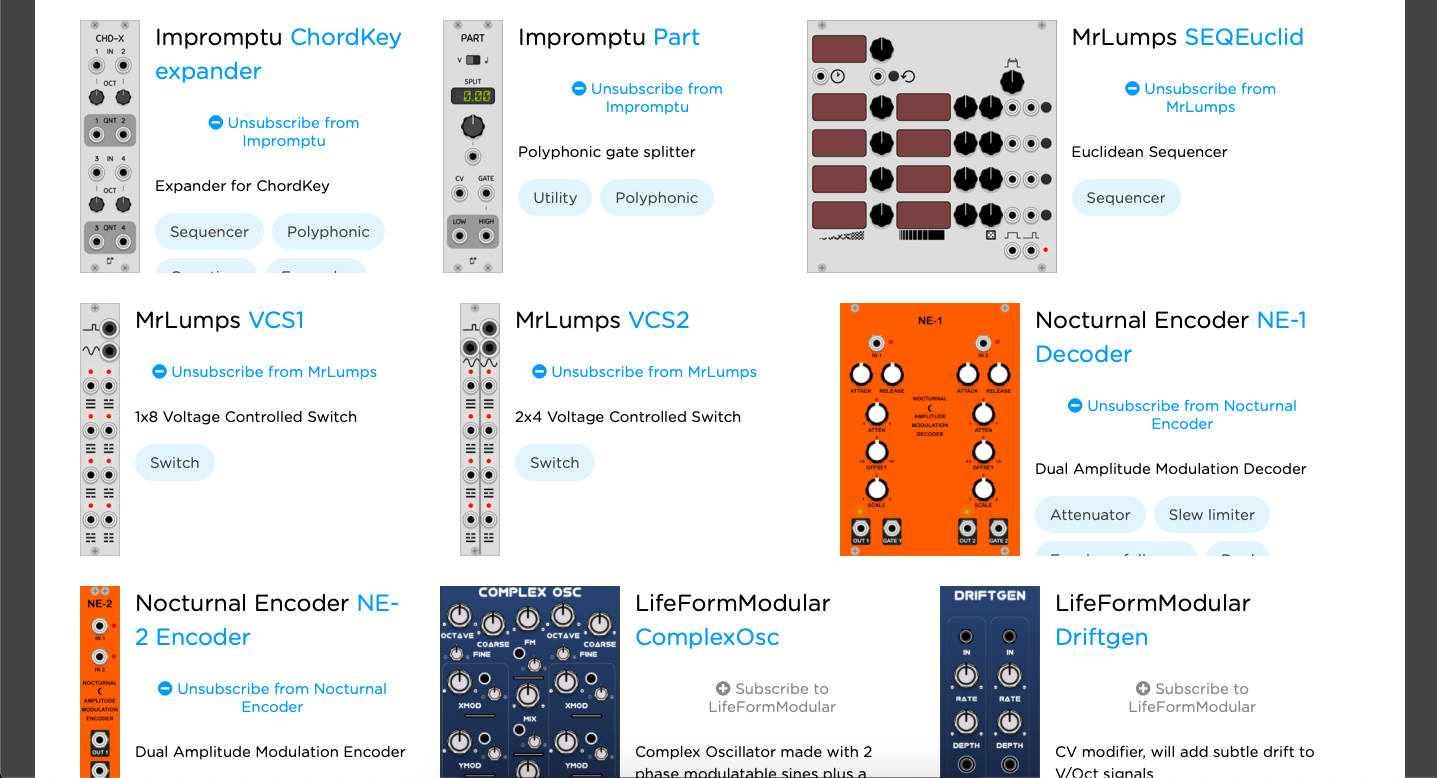
I suggest adding a border of some kind around each module, or some shading just to make each one a bit more distinct and self-contained on the page. Particularly with different numbers of modules on each row the unruly combination of pictures and text sprawling out over an expanse of white is untidy and messy and a little upsetting.
Otherwise, cool!
Using a mess of Python, git history, caching, and backend code, I’ve added the ability to sort individual modules by their creation time. This value is defined by the timestamp of the earliest git commit containing the .modules[].slug in the manifest file for the plugin/module in question.
This is now the default sorting mode on the module index and plugins page.
9 Likes
To be honest, this layout kinda confusing and glitchy right now.
I understand all the difficulties associated with the development of such a big thing, but nevertheless, I propose a few changes that probably may help. Let me dream up quickly.
In fact, these are cards arranged on a grid, with small gaps and without visible boundaries. Also tags fall outside the container boundary and we see the name of the developer twice, which is not necessary at all. Plus there are also problems with color coding: subscription is a positive action, so this button should be blue instead of gray. Unsubscribe can be red…
Okay. After 5 minutes in developer tools, we can get this picture. These changes reflect my first thought about how it might look in an already given style. Pay attention to the first card. I suggest replacing the long sign “Subscribe" / "Unsubscribe” with button “Add” / “Remove” / “Add to cart” placed at the bottom. Place developer title after module title, get rid of color coding there and link this to the module at the dev page.
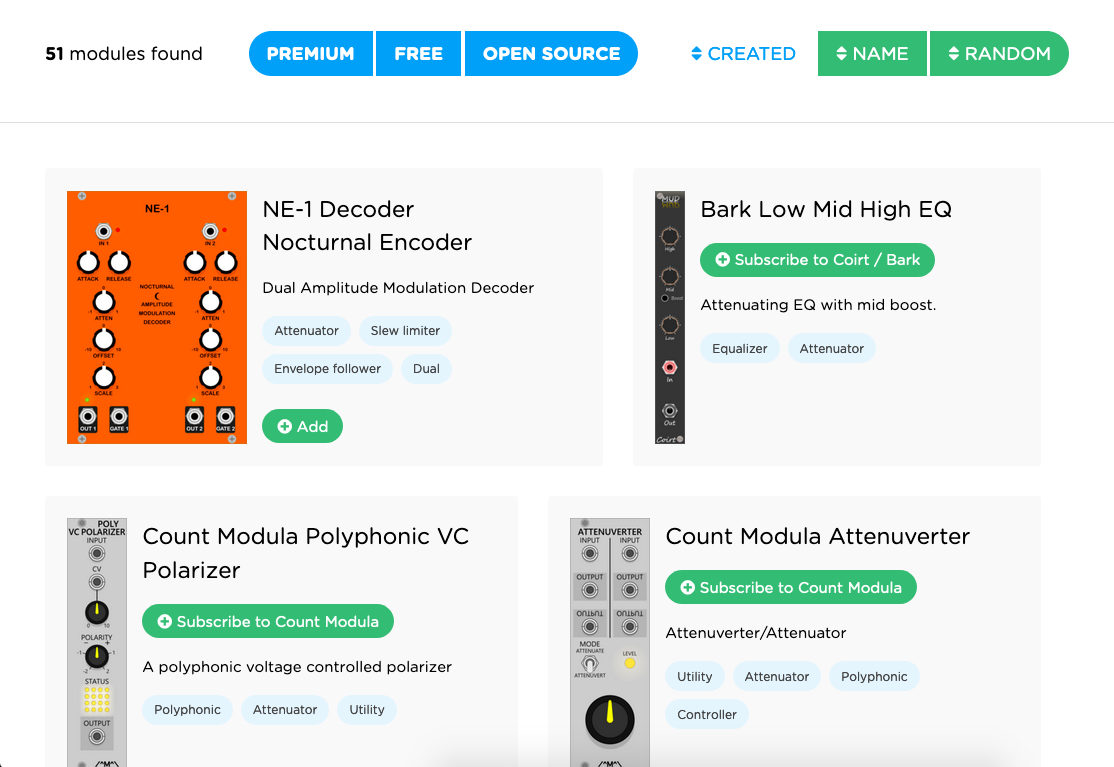
This is the first sketch, and in fact there is still a lot of work, but the general direction, I hope, is clear.
1 Like
The design’s fine for now, I’ll leave as-is.
From the instructions at the bottom of the page:
Adding individual modules will be allowed when Rack v2 is released, since this relies on its module whitelist feature. Until then, you must subscribe to the entire plugin.
In other words, the text “Subscribe to Nocturnal Encoder” is temporary.
Yep, I understand that this is kinda temporary and will be improved while the v2 is being developed. But it’s definitely worth taking into consideration a certain border between the cards and the problems of color coding. This is something like user experience standards, because we want to make navigation easier for the user. I understand how busy you are, just sharing my thoughts and experience as frontdev. And that’s it. ¯\(ツ)/¯
I already forwarded this opinion to my designer when it was brought up last time.
1 Like
Maybe you should call him “the” designer. This may be apocryphal, but the story goes that once, Mick Jagger — drunk — called from his hotel room down to Charlie Watts hotel room in the middle of the night, “get up here! I want my drummer up here.” So Charlie got up, put on a suit and went up to Mick Jagger’s room. When Mick answered the door, Charlie punched him in the face and retorted, “you’re MY singer!”
Funny story, anyway. 
7 Likes
Another issue. Looks perfectly fine on iPhone / Safari except for the heading which doesn’t break the line.

The VCV library does not show the last updates? VCV Rack showed and loaded new modules here on Mac that were not to see in the VCV Library? Anyone else? Any idea?
3 Likes
Can you specify which new modules were downloaded by Rack?
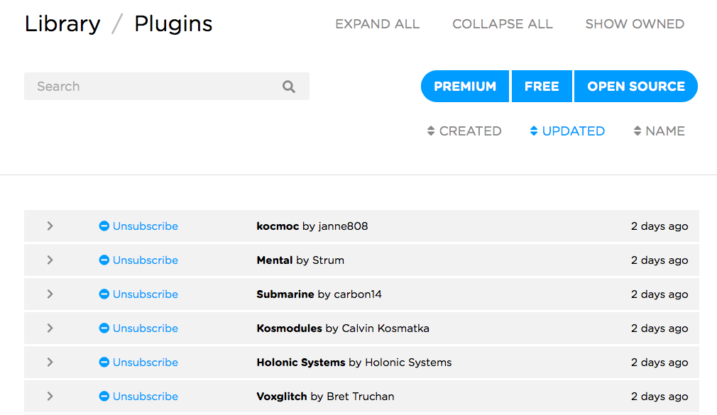
voxglitch kocmoc Mental Kosmodules-Free
None of those plugins contain modules that are newer than 3 months ago. Read my above post about switching the default sorting mode of the module index and plugins page.
But they are UPDATED just a few days ago, and that is not visible in the Library.
I saw what you did, Thank you.
Ah, @jue was talking about the Plugins page. (It’s good to specify these things.) The buildTimestamp was not being updated after the recent addition of the cache. Should be fixed now.
3 Likes
Depends on who’s paying who.
2 Likes
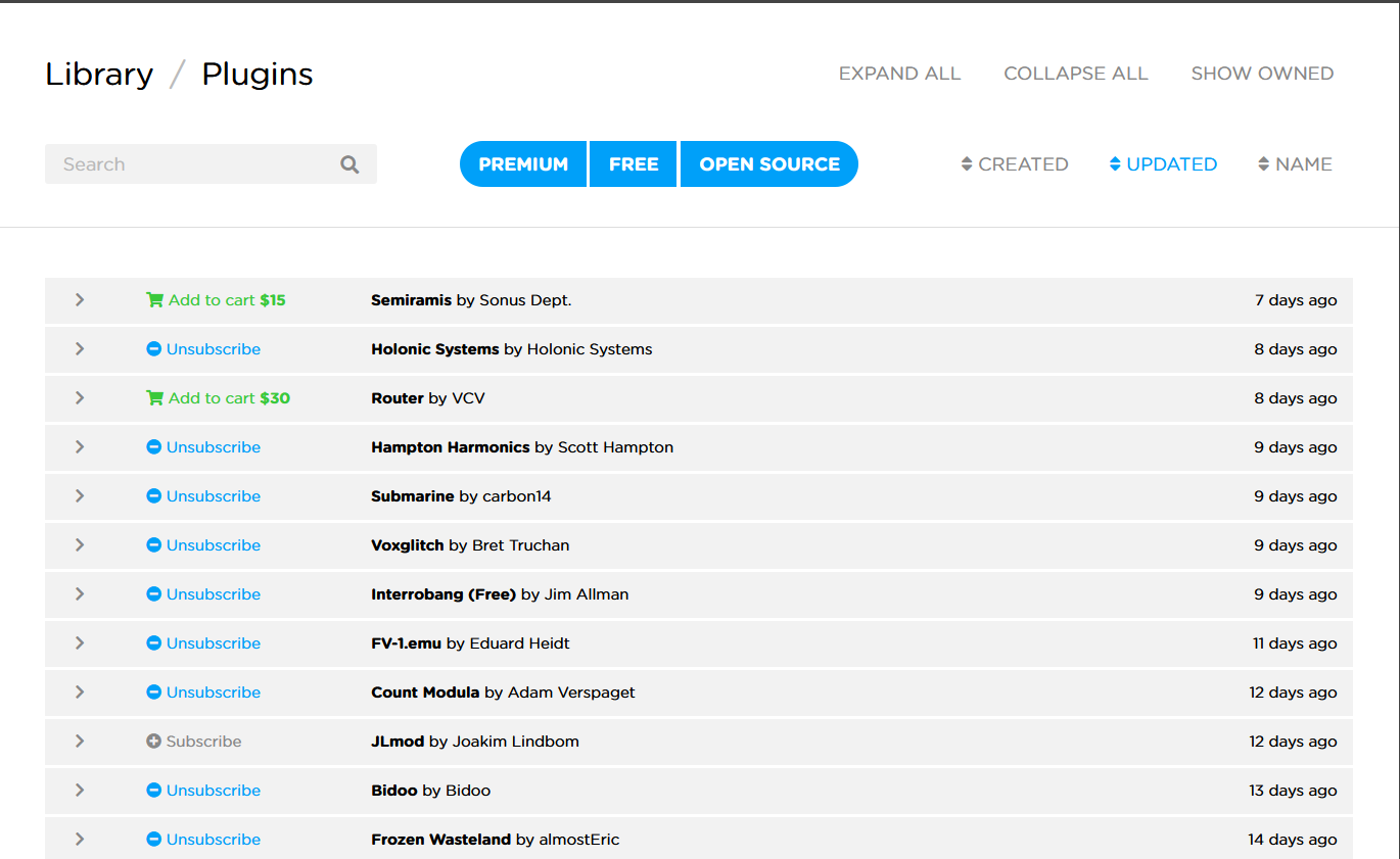
Now it looks like this:
This is what I expected to see!
There is written Library / Plugins and this is called Plugins page? May be its a language problem? Was thinking of it as Library page because the first word is Library and not Plugin? This specifications are very difficult to understand for me!
The entire website is called the VCV Library. Every page has a link back to the index page by clicking “Library”. Just like other websites, there are subpages at certain URLs. This page happens to have the URL /plugins and has the subtitle “Plugins”.