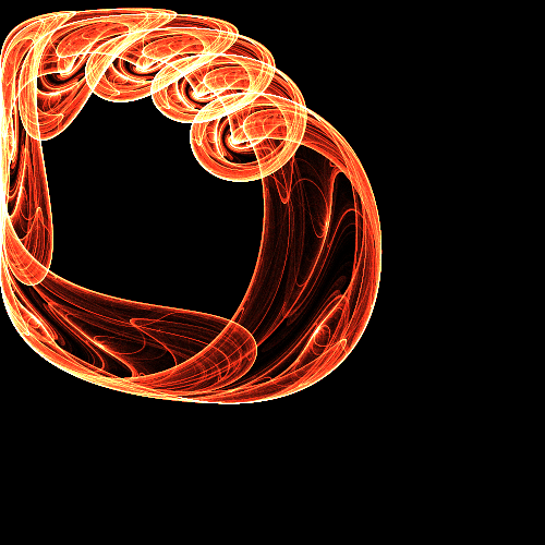
I found it within a page by Paul Bourke, here: Simone attractor created by a professor named Simone Conradi. Not much documentation on it besides a matplot that i havent run personally. What jumped out to me about it is that it’s essentially the Mandelbrot math, just sans Complex numbers, with components separated, given independant constants, then ‘circle-ified’. pretty pictures by themselves, and smoothly moving the A and B values does give smooth motion when tracking a particular point, but I was able to alter the way it’s built up such that the “shape” is retained, and tracked points move smoothly along the paths at a chosen speed(kinda, it is chaos). plotting with a whole starting grid is a drawing task and unnecessary for outputs, but I still need to pick one, do it’s iterations, pick one of those, then step forward in time(which is technically just walking really slowly in a small circle around the starting point).
Just so I understand: Your module takes that pair of equations xn+1=sin(xn^2-yn^2+a); yn+1=cos(2xn yn + b) and for each sample given an A, B, x0, y0, outputs Xn Yn for some N, where A B x0 and y0 are inputs?
For which compilers is that true? In the past I’ve found that some of the cmath functions execution time varies enormously from, say, mac to windows.
that’s a very good way to do it. less good, but quite doable is to just use rack’s CPU meters and selectively take out part of the process function to find where it’s spending its time.
I wrote an article a long time ago that has some info that could help doing this: here
Horner’s method has numerical positive properties independent of the CPU. But that doesn’t matter here.
The pair of eqns is
x_n+1 = sin(x_n^2 - y_n^2 + a)
y_n+1 = cos(2 x_n y_n + b)
If you look inside the trig you can see it looks like the square of a complex. So if we define
z_n = x_n + i y_n
c_n = a + i b
then the system becomes
g = z_n * z_n + c_n
z_n+1 = sin(re(g)) + i cos(im(g))
which I can evaluate pretty quickly on my mac.
#include <complex>
#include <cmath>
#include <chrono>
#include <iostream>

int main(int argc, char **argv)
{
   std::complex<float> z{0.f, 0.f};
   std::complex<float> c{3.69, 4.51};

   auto start = std::chrono::high_resolution_clock::now();
   for (int i=0; i<1000000; ++i)
   {
      auto tm = z * z + c;
      z = {std::sinf(tm.real()), std::cosf(tm.imag()) };
   }
   std::cout << z.real() << " " << z.imag() << std::endl;
   auto end = std::chrono::high_resolution_clock::now();

   auto elapsed_us = std::chrono::duration_cast<std::chrono::microseconds>(end - start);
   std::cout << "Elapsed time: " << elapsed_us.count() << " useconds" << std::endl;

}
Did I get that right? maybe I got it wrong.
Nice!
Yes, exactly, where a bigger N forces it onto the ‘path’ harder, with the added alteration of movement over time by incrementing (x0, y0) around a small circle. It actually makes a pretty cool sounding oscillator at audio rates, but it’s main use is as a ‘repeating’ chaotic modulation source. Also, last night I took all that I learned here and with float_4’s and vcvs sin and cosine approximations, it took it from 30% cpu, to around 3%. Absolutely incredible.
During the alteration testing phase I did do this complex insertion , so that I could more easily change the exponent, much like you can do with the mandelbrot, but the results weren’t my favorite so I returned to real numbers.
Also on the topic of mandelbrot, another module I’m working on (actually my first module, as ridiculous as it may be to do this first) is a fully fledged fractal generator turned sequencer, with six fractals, 4 of which I kind of “made”, and Julia’s of all, fully parameterized, with control also of the starting point and length (up to 128) of the sequences generated, which are Independently output from the x and yi, with associated triggers when their values change enough, and an auxiliary output i’ m still working on, things like sum and average but I also want to compose a wavetable based on the iterate values of the image istelf. Can also run at audio rate when run by an osc, like pony, and while it is kinda hogging the draw time atm, it’s still only running at 8% cpu for all that and my ineptitude.
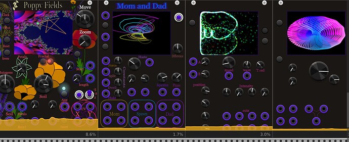
Just for Fun, because I haven’t really been able to show anyone else these yet since they aren’t fully finished (but they do all work!), here’s the 4 modules I am currently developing. from left to right: --Poppy Fields, clearly the most “finished”, the Fractal Generator sequencer, that also includes different visual styles like buddhabrot. --Mom and Dad, an alteration of the Dadras - Momeni 4D multi-scroll chaotic attractor, output in independent triplicate, with a visuals switch to look at different axes and get that lovely 4D wiggle (it also rotates on its own for show). --Simone, the currently discussed Chaos ( still clearly in the creative phase). And finally, --I don’t know what I’ll call it, but the one on the right is a Toroidal 2-op FM osc, with a choice of a few different equations that produce different shapes, and is just starting to be built to a usable degree.
Glad you got it where you wanted it!
Seems great!
If you want a little bit of unsolicited UI feedback, they’re a bit hard to read. The ports probably need to contrast less with the background, and the text more. Otherwise this seems super fun and would love to see these in the library one day. Good luck with the continued development!
The UI’s definitely all need a lot of work before actual release, graphic design is not necessarily my forte. If I may ask, in a general sense, do you think the poppy art on the panel for Poppy Fields is too busy, what with all that’s happening on the screen? I do want thematically related design of course, but idk if just straight up poppy art is it.
It’s very challenging to get pictorial in backgrounds. You need to think “wallpaper” over “pretty picture”.
Needs less contrast in the background so that it sets behind the knobs and text. Right now the text is so dark it blends into the background. Human eyes are least sensitive to blue.
Definitely need to make the text more readable. A different font with fewer very thin lines will help. The poppies may be ok after the text is fixed, perhaps more judiciously placed to not interfere with knobs and labels.
A lot of this is personal taste, etc., which is cool. I too like legible text. There is for sure a LOT of information out there about what is considered good visual contrast, how not to use colors.
search for “accessible UI” and one will find a ton, as you know.
I’m not crazy myself with this font, but I wouldn’t say it’s terrible… might be taste? (yes, I like very plain readable fonts, and use robato for just about everything.
Very much a matter of taste. A font with thin lines loses more legibility against a patterned background than say a gothic font without such a difference in thick/thin. Another tactic is to put little plain panels behind your labels (think dymo tape labels). Of course, this yields a really different look.
Do what makes you feel good. Fluorescent glow-in-the-dark look takes me back to parties in the dorms in the late 70’s.
For me the Poppies look good, but at the expense of the readability of the module. It is overly busy and competes with the controls and ports and fractal display.
Some things to think about
- Including images of poppies makes sense. But I don’t see the point of including other flowers. That just becomes something that can distract the mind.
- Ideally I think graphics should reinforce the design of the UI if possible. For example, perhaps stems could establish a link between a CV input and associated control knob. Or if there are logical sections in your layout, maybe you could use color coding of the petals to delineate those sections. But be careful, don’t overload the design with too many colors.
- Perhaps the graphics don’t reinforce the logical layout. But they should not compete with the controls or ports. You don’t want them to confuse the eye. Perhaps keep them distinct from the controls, or make them more muted, or . . . ?
- I assume the fractal image is a dynamic display. I should think you would want that to be a focus, which is even more reason to be judicious with the amount and / boldness of your static graphics.
- Do you want to support light and dark themes? Many people like having theme options. It is not required, but it should be a conscious choice on your part. If you decide to support light and dark themes, then you need to come up with designs that work for both.

