I’m looking for inspiration for my stepper controls. By stepper, I mean a control that cycles through a number of labeled options. (If there’s a better name for that kind of control, let me know.)
My only steppers so far are in my Func and Func 6 modules:
Func Module Panel
In that image, the stepper in question is the button labeled “±5”.
I’m not satisfied with the current graphic design of my stepper control. It isn’t clear from the graphic that this is a stepper. Graphically it is indistinguishable from a button, and buttons typically have a boolean value (pressed or not). So you can’t tell from looking at my stepper control that it will cycle through options.
I could use some inspiration here. What modules have great stepper controls?
I’m especially looking for examples of compact stepper controls. (My upcoming module has only a small space for the steppers.)
My first thought was that a dropdown requires 2 clicks.
But… Now I realize that by using a stepper, I’m artificially imposing an order on the options. So to get from the current option to the previous one, users have to click through the entire sequence. And that’s usually more than two clicks.
The context menu idea doesn’t appeal to me, for two reasons. First, it’s not visible on the faceplate. Second, my upcoming module has 16 channels, each with two steppers. That would be quite awkward, i think.
But I’ll give the dropdown idea some thought. And now that I recognize (duh!) that I’m artificially imposing a sequence, that frees me to consider other options.
That’s a nice design. It might work for one of my parameters, which has only 3 choices… if I could think of tiny graphics instead of words to represent the options.
I think some of the Geodesics modules have a similar idea, with options displayed as lights around the button.
My other parameter has 6 choices. I don’t see how to make that work, given my tight space constraints.
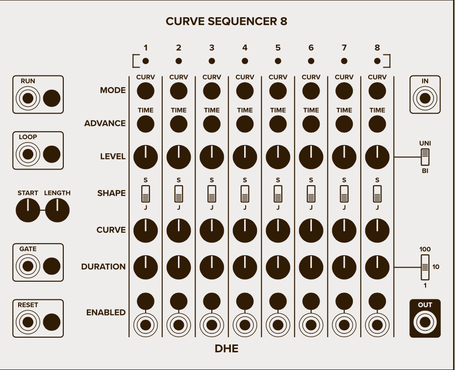
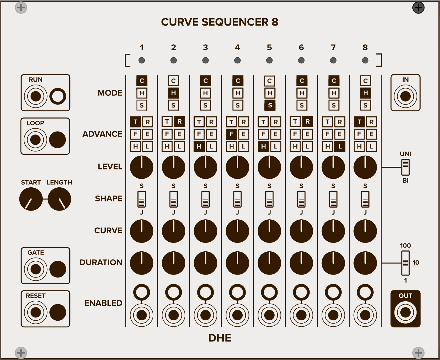
Dunno if this helps, but here’s the panel of the middle-sized version of the new module. The params in question are the MODE param (which three choices) and the ADVANCE param (six choices). So you can see that (given my current design) I don’t have a lot of space for these params.
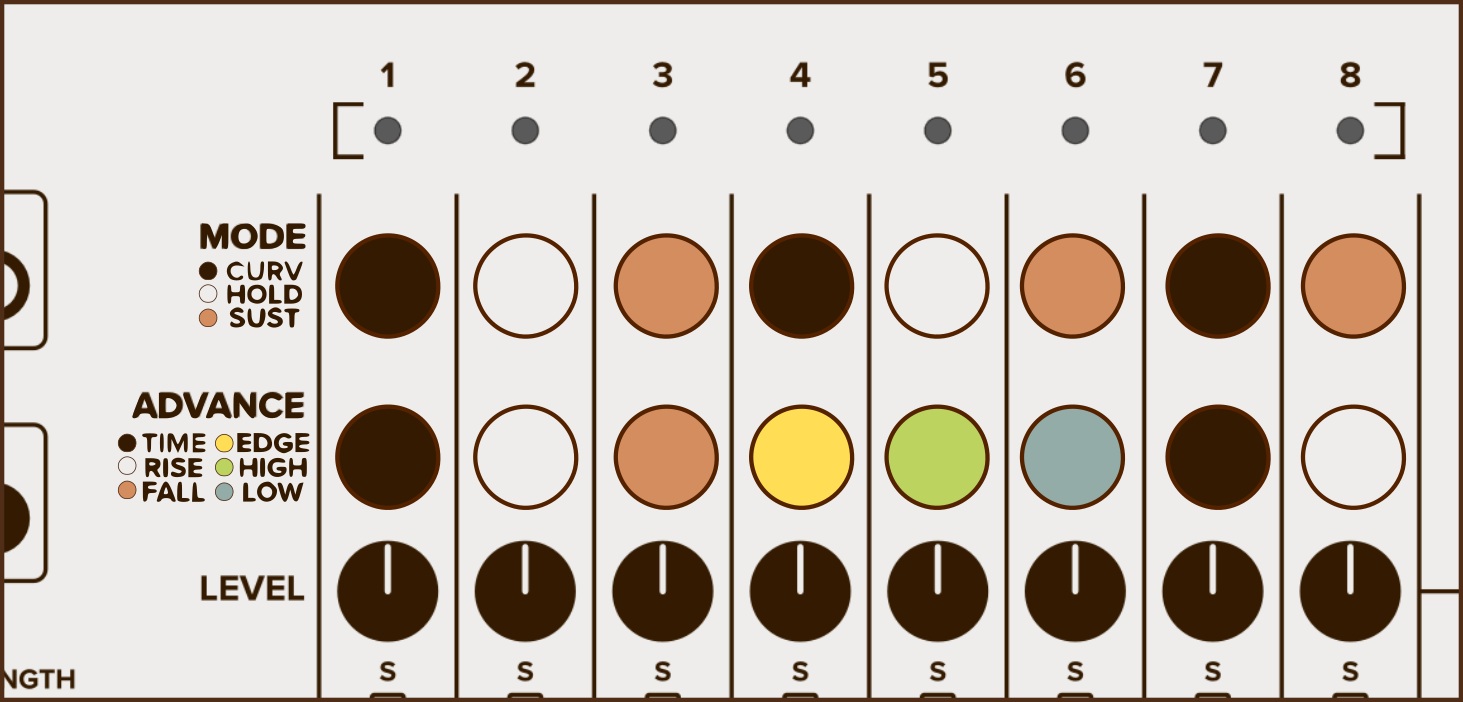
Also, take a look at Audible Instruments. Almost every module has steppers that are both color and position coded. Other thoughts (especially as you have 6 states) include 3 LED binary representation or a small single digit 7-segment display to represent the state.
Yeah, color is a possibility if I can find a place for the legend.
This is helping me identify the essence my dilemma: expressiveness vs space constraints. My current graphic shows only a single option, and not only hides the others, but fails to indicate that there are other options. So it isn’t as expressive as I’d like it to be.
The controls you and others have presented have made all of the options explicit at the expense of some amount of space. And to conserve space, they encode the options in some way—initials, small icons, or color (plus a legend).
So one challenging possibility is to find a way to encode the option names. Another is to see if I can squeeze all of the option names into a small space.
All of this is greatly helped by the parameter tooltips feature, which I love. With parameter tooltips, maybe all I need to display is a hint about the option. Then I can put a little more detail into the tooltips.
A stupid but practical way to do it would be to have a bit of text on the module that just outright says the steps. Not by the stepper itself, just to one side.
I see you are using the standard button. It has a pretty large area which is a great real-estate for an indicator. Remember that you can layer widgets on top of each other so you can easily top it with a two-character display widget that will indicate the state quite expressively.
Do you mean draw the label (or a few characters from the label) onto the button?
I think that would show the current state quite well. And drawing the text onto the button might give a hint that there are other options, even if it shows only the currently selected one.
Is that what you mean?
I suspect that using a round button may be part of my problem. Perhaps another shape might give a better hint that there are other options. Maybe a trapezoid pointing upward, or a diamond. Something with arrow-like thingies on it.
What about moving the module name to the upper left corner, writing it on two lines? That’d free up enough vertical room to avoid having to collapse all the controls together.
What if you moved the in port and had just the 1 (2) display at its co-ordinates to serve all 8 channels? It would be a little more coding as it is 1 display serving all channels but you could do both the momentary button and the display. You would require some bools for channels with or statements setting true for each param selection, which could set the display to that channel.
Lights are probably the better way to signify a setting alright, but I like your design myself perhaps it just needs to be a little more screen like (gradient and or background colour)
In my opinion this would mimic the hardware feeling most and you don’t need to use colors or text. The current state could be put in a tooltip as a little help. It’s all personal taste, but i’m not a big fan of right click menus, switchable text boxes etc. as controls. I also don’t think that everything have to be “printed” on the faceplate, that’s what the manual is for.