@pgatt
This time everything is regular! ![]()
So, people, this is a rough draft of my Rack idea, just a small fraction of the modules I have in mind, it’s just the panels I’ve made so far. Suggestions?

@pgatt
This time everything is regular! ![]()
So, people, this is a rough draft of my Rack idea, just a small fraction of the modules I have in mind, it’s just the panels I’ve made so far. Suggestions?
Bit too dark for my taste, maybe instead of black use a grey tint?
Also, will there be light panels for those that like those? 
Btw usually people start with the DSP and then figure out panels later  But in general these look nice, what did you use for the designs?
There is nothing really black, it is very dark gray. Obviously I made them according to my tastes, and I love dark themes, but I will also make a light version and maybe (calmly) other versions, in any case anyone can change the colors according to their tastes.
I have launched into an adventure, with graphics I get along quite well but I don’t know anything about DSP hahaha, so now I make the graphic project, then I will study to be able to transform it into working modules, I may not be able to do it and maybe I am doing all to no avail, but I’ll have fun anyway.
I use Inkscape.
I can hardly see what’s on them so for me it would be a no-go. I need good contrast to actually be able to read things. For my eyes something like these are perfect:
This is an easily solved problem. As long as it comes to color and contrast, I can make 150 versions and please every single person.
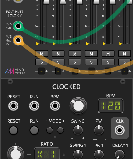
I was looking for technical suggestions such as the positioning of the objects, in particular maybe the lights, I inserted them without thinking about the final utility, for example in the CV inputs there is nothing that shows the progress of a possible modulation, it is necessary to add lights? or move them?
just my 2 cents, obvs, but I’d like to see more metal in the metal parts. Aka brighter sockets.
There is also painted and therefore dark metal, however a little bit of shine might actually be better for me too. It’s ok? (Look at the octave module)

Looking good, my suggestion will be to move the little blue lights next the outs of the modules in upper-right perhaps (instead of the current lower-right) position. currently when you patch cables the cable hangs down and will go over them… just my 2 cents. Overall nice and clean design.
I think the same thing could happen even if you move them, no?  It depends on where the module is placed and the direction of the cables.
For example, if a cable from the LFO is directed to a module that is in the upper right, it will pass over the light.
It depends on where the module is placed and the direction of the cables.
For example, if a cable from the LFO is directed to a module that is in the upper right, it will pass over the light.
Sure, so probably light above the port will be the best? there always going to be situation where in some position will go over, my thinking is to sort the 90% of the cases, the remaining 10% will leave up to the Universe to solve. 
Okay, I moved the lights and made all the elements stand out a bit. It looks better to me now. Having probably spent more time looking at these panels than you have, my eyes got used to it and I didn’t realize it was all a little too dark. Maybe the light part of the knobs needs to stand out a little more (?)

For my personal taste it would need these changes:
Overall layout is pretty good, but I’ll make the mixer’s main outputs vertical, to match the flow of channels.
Yes, contrast! Mostly, the interactive widgets (ports, toggles, knobs) lack contrast.
This is more a personal thing, but I’ll have strange anxiety looking at thin lines in UI, which are the orange outlines and borders, so IMO they could be made thicker, or you can reduce the amount of them.
Since this design is more skeumorphic, more elevation is much needed for these interactive widgets, which bump out on a real module. (toggle is good enough, ports need some, knobs need much more)
I can’t guess the functions of out lights, looks like they represent out values but that will be redundant:
(also yes they will be covered by cables)
Font is cool but do not feel very fitting with this design, it’s probably okay as a large display font, but at small and medium size it looks (weirdly) kinda cursive and not very readable, also the kerning is a bit off:

![]()
![]()
These 'P’s and numbers could be aligned as monospaced, or change to a mono font:
Thanks for the completeness of the answer, that’s exactly what I need!
“but I’ll make the mixer’s main outputs vertical, to match the flow of channels”
Yes, I will work on it.
“contrast! Mostly, the interactive widgets (ports, toggles, knobs) lack contrast.”
If you talk about the originals, I agree. After the last modifications it seems to me that the ports are clearly visible even from a distance, and I have just fixed the knobs as well.
“thin lines in UI.”
Those will remain like this, I’m sorry, I have already tried to make them thicker and I don’t like them, reducing the quantity would not make sense in my opinion, they are there for a reason, where they are not needed I have not put them.
“more elevation is much needed for these interactive widgets”
If you always refer to the contrast, as I said I think I have solved it. If we talk about a more “3D” effect I can try but I don’t guarantee, even if I get along well with graphics and I like to work on them, I’m certainly not a professional, I did a much too good job compared to what I thought I knew how to do.
“I can’t guess the functions of out lights”
Honestly neither I, I have not been in the modular synthesis environment for a long time, I put the lights on only for graphic purposes, I thought that someone here could show me some more useful positions but nobody has done it yet. Probably the lights where I put them now, are a simple signal that says “something is coming out of here” but actually in Rack they don’t make much sense because this signal is already shown in the ports inside the cable, even if it is something that i don’t appreciate much, i wish the cable would close the port completely, like in hardware, then my lights would make sense.
“also the kerning is a bit off”
It is a free font taken from the internet, probably made by another non-professional, in previous versions of the panels it had even more problems, I have already achieved a good result, I’m not sure I can do even better, but I will keep these problems in mind and I will try to solve them somehow.

That’s totally fine, it’s just a minority of people like me may actually be physically uncomfortable about that. It’s not that serious though, can work with a couple of modules. (For very extensive use it’s a real problem, I can’t use KDE for this reason)
Yes, elevation can be achieved by some “effects”, commonly drop shadows, long shadows, etc. you can also use perspective, or go full on to realistically trace actual physical objects. But elevation can also be achieved by colors/contrast, which you improved (thus ports do not need very much after that). The latest version improved knobs’ elevation as well, and I think it’s good enough.
Now doing shadows is more a style thing. If you are going to build the actual plugin, and follow the basic API usage from official examples, I think Rack will by default place drop shadows for these widgets. Some third party modules don’t have that, so you can decide to use it or not (I don’t know how to turn it off though).
Yeah if you like the style of this font for this design, you can definitely tweak it to work better. My suggestion is to try other fonts and see if you like them even more, since this font does have problems.
I’d say the ADSR in particular needs attenuverters on the CV inputs - and there’s plenty of room for them.
Yes, I already plan to make them, I’m just thinking about the best scheme but probably if I don’t try it I’ll never find it.
The space is further increased because I raised the whole upper section slightly to align the first knob with those of the modules next to it! 
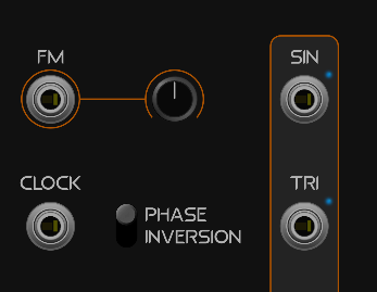
I’ve made various combinations, obviously it’s all work in progress so there are things to fix, it’s just to give an idea of what it will be.
Dark (default)

Dark with contrast on the outputs

Light (@dreamer here it is)

Light with contrast

There will also be an intermediate version, but first I fix these so that then I can only change the colors without having to touch up anything.
I think I like the second one best, and then the 4th as light alternative (i’m a dark-panel aficionado myself, but as said before “good contrast” is quite important)
They will all be options to choose from. I don’t really like the two versions with contrast on the outputs, but they are a standard of VCV Rack, so I will leave them. Then, not having the skills to invent fabulous modules from the technical-audio point of view (I think I’ll steal pieces of code by creating a puzzle, to begin with I will have to do it) at least I try to please the eyes
Generally I like of the “with contrast” versions, preferably the “Light with contrast”, with the exception of the VU meter. It could use a darker background, like the meter under the VOL knob.
And, for all versions, maybe a wee bit more contrast in the SCALE push-buttons shading.