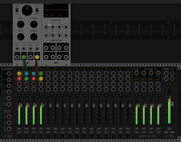
I like the variety. It makes the interface “readable” at a distance, i.e. you can get a sense of the plugins being used
At first I look what a module can do and how that sounds, but when the gui delays my workflow, I mostly don’t use it very often. But there are not much modules I don’t use, but sometimes you have to get used to it. My favorite designs are Lindenberg Research, Vult and Audible Instrument. For some developers I made custom skins that better fits my personal viewing habits.
There are definitely modules I would use more often if I thought they were better looking. There are also modules that I instinctively reach for regularly, in part, because they’re so good looking. That said, there are probably about four classes of modules (when it comes to appearances) in my mind:
-
Modules that look great. Geodesics, the Oxidlab stuff, Vult, Lindenberg, Mindmeld, etc. These not only look great, but their GUI’s are highly functional.These are the head-turnerss. This is the stuff I want in my rack patches because it brings me joy to look at the UI’s.
-
Modules that look good and are well laid out. I’d throw Fundamentals, Audible, Squinky, BogAudio, Impromptu, JW, ML, etc. in this category. Nothing that’s going to make anyone say “OMG, so gorgeous” but looks more than good enough and gets the job done. Use this stuff all the time too.
-
Modules that have cluttered UI’s but otherwise don’t look bad. A lot of the NYSTHI stuff falls into this category for me. They’re good, often necessary, but there’s so many buttons, inputs/outputs, crammed into a small space, often misaligned items, that I’m slightly less inclined to use them when there’s a better looking alternative that does what I need. But sometimes they’re so handy or so specific, that they’ll get used anyway, and that’s fine.
-
Modules that just are offensively ugly to my eyes. There aren’t many but quite a few. I won’t try to shame anyone, especially because some are intentionally aesthetic decisions, but there are modules I will do anything in my power to find an alternative for because I just hate the look.
Just my own two cents of course…I’m just one guy on the internet.
Hey, proud to be in category 2. Thx.
What get’s me the most are:
- Modules where fontsize is much smaller than average.
- Modules with a cluttered and confusing UI, even missing labels sometimes.
- Garish colors, but I don’t mind that so much if everything else is Ok.
Like I said to Antonio: If the NYSTHI modules had a clear and consistent UI it would be a killer plugin. He agreed. As it is now I sadly reach to e.g. NYSHI as a last resort, but I wish it wasn’t so.
For a model of great layout I would say Vult, except… he has taken to using too small fonts lately, which is a pity.
ANATEMAAAA!!
PENITENZIÀGITE !!

What would be your minimum acceptable font size at 100% zoom?
and decent docs too. Ah, the pain of figuring out how the heck they work…
If you develop clean or eclectic artistic designs for your modules doesn’t matter to me. The module just needs to be functional as provide options to help get your ideas out of your head in to other peoples ears. Coming from a guy who thinks that sloths are the true kittens of the feline kingdom.
In defence of NYSTHI, I find most of the modules intuitive enough not to need docs, and the ones that are less so make for a nice challenge. Considering they’re free I think they make a great asset for VCV, I just wish they were also open source.
After looking at the source code for Modular Fungi LightsOff I don’t think there is any nanovg trick. Looks like it draws a giant translucent box over the entire rack, and then re-draws lights and ports over the top. Take a look at LightsOffContainer::draw method.
Good point. I recently switched from a very old 17" monitor to a “4k” monitor and VCV looks so sharp and good at “retina” resolution that I can see how if a developer only had a monitor like this that they would mistakenly use fonts that are too small to read on a “normal” monitor.
Ah, that’s just what I needed to see, thanks! I changed the MixMaster VU meters to derive from LightWidget instead of OpaqueWidget, since those are part of what gets redrawn, and now those VUs look nice in the dark too! ![]() (@steve)
(@steve)
OOOhhhhhh yesssssssss!
I think basically like Andrew says: Stick to the approx. size of the VCV/fundamental modules and all is Ok. Consistency, in a way, is even more important than absolute size, because if all modules use roughly the same font-size, then you can zoom in until it’s right for your eyes, and all fonts are readable.
Yes, but actually a clear and consistent UI can help a lot with that.
Personally i don’t care too much about the visual design but about the legibility instead, as an example the Strum’s VCV Modules very difficult to read. Another example are the µmodules from NYSTHI with a very nice look but very tiny to my eyes!
Fantastic work! My eyes thank you ![]() Next stop, scopes & analyzers.
Next stop, scopes & analyzers.
Excellent work Marc 
Do the little filter LEDs show up too?
Interesting. Just looking at the pictures, it seems like the problem might be that they use a font that isn’t very legible? The size doesn’t look too crazy.
