Thanks Marc. I am going to give this a try. In the process I am totally blowing away the SVG panel image and drawing my logo via nanovg. That way I do not need to worry about inverting the SVG colors, but no problem if it is inverted by your code since it gets cleared anyway.
What about knobs and such? One thing that always stopped me in the past was that it’s easy to change the background color of a panel, but sometimes when you do that the resulting panel doesn’t look good with your knobs. Hence the appeal of the Bogaudio implementation where your knobs change, too.
I guess starting from scratch you would be wise to just use controls that look ok on all your backgrounds. But starting from not-scratch it can be daunting.
2 Likes
Agreed, and before the new component library in v2 I did indeed also have to change knobs and buttons and such for dark vs light modes, but now in V2 I think their new looks are more conducive to fitting well on dark or light backgrounds, at least for my taste, and the only ones I change now are the screws, which get rendered after the inverter widget, so I can use the light ones with the light panel mode and the separate dark screws with the dark panel mode.
1 Like
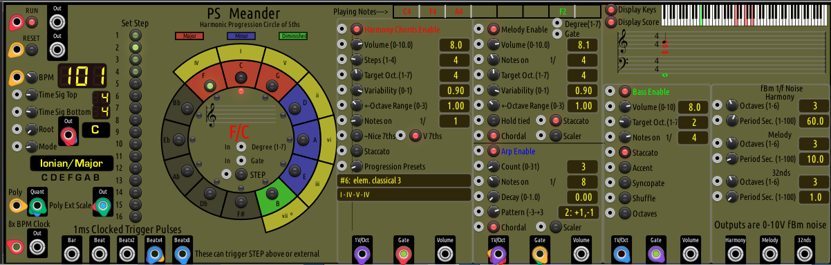
After messing around with the inverted color protocol for a couple of days, I have decided that implementing it would probably require more changes to Meander than I am will to do. I did change to an SVG file that only sets the panel background color since all Meander panel graphics are done at runtime via nanovg. I created some variations of darker panel themes to experiment with. The following uses a midscale gray which shows all that Meander uses legibly. It is not the most aesthetic dark theme, but any darker results in inability to discern some things.
Do any of you who have asked for a dark theme find the following acceptable? If so, I will allow option menu switching between the light and dark theme panels in the next release. By the way, reducing the room lighting works pretty well with this dark theme, down to some level you can choose where you are willing to sacrifice readability for eye friendly theme.
2 Likes
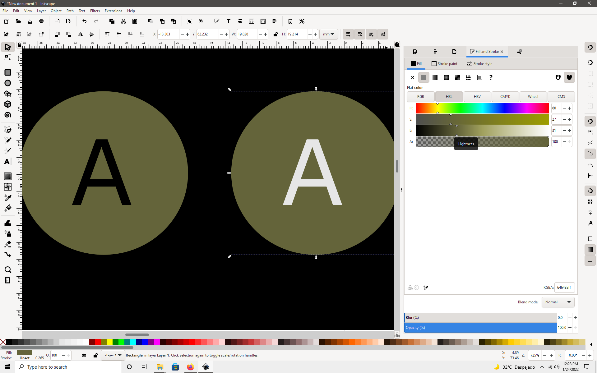
in order to make it readable, you should considerate the contrasts of the fonts against the background, your background is 31% lightness it mean , black fond is 69% unreadable (if you use pure black) . in that background withe fond could work better.
Absolutely. Of course that is what the inversion methodology does automatically at runtime. Meander source has 897 nanovg function occurances, so it is very tedious to do some type of nvg color inversion override at runtime. I still may give it a try in my own way. Thanks for your input.
But, I still need to know from Meander users with vision challenges whether making the option available that I showed above helps the situation of being overwhelmed with screen or panel brightness. This question is separate from the readability question, unless the user finds that the readability degradation outweighs the brightness reduction in terms of personal experience.
I am very interested in accommodating those with challenged vision (and perception) and less interested in doing work that optimizes visual readability, particularly at the personal idiosyncratic level, which seems an impossible task to me.
1 Like
Definitely an improvement for me Ken.
2 Likes
Thank you, Ewen!
1 Like
While I am still slowly trying to use Meander, I think the new colour option is good.
“users with vision challenges”
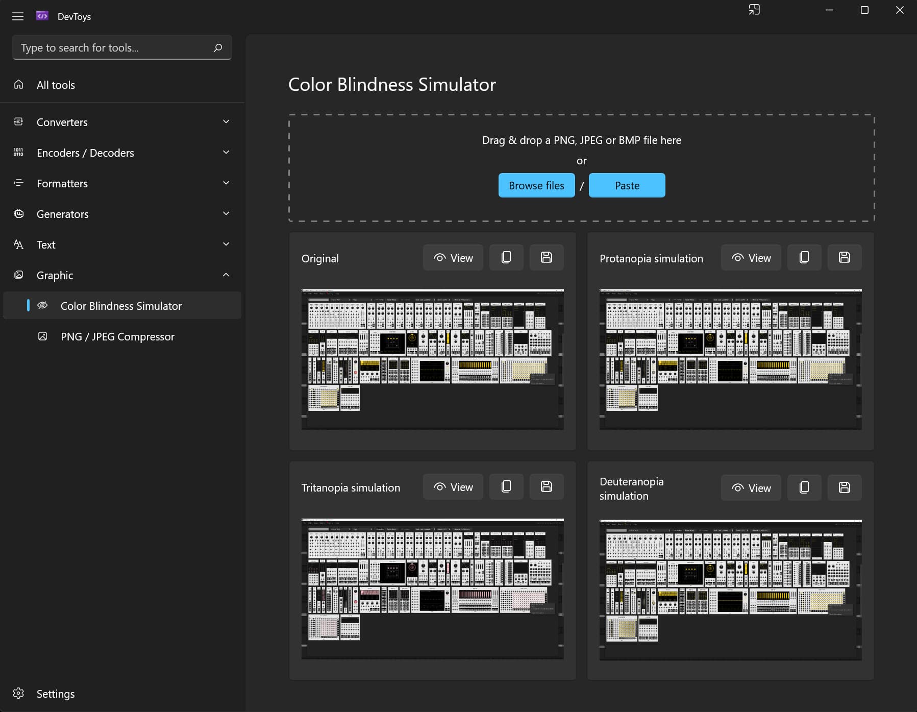
I am sure you are aware of tools that can help with different visual abilities, I use this one for graphic design. If you use Chrome as a browser it is an extension that you simulate your content according to different vision conditions. Of course, this goes to all developers that want to check if their modules are accessible to people with different vision.
2 Likes
3 Likes
Off topic alert!
That takes me back. One of my projects at my first proper job was to update a weighbridge management system to cater for colour blind users, that was in 1988. I feel old now 
4 Likes